

Inspiration | 10 Local Artists Inspired by Our Landscape
For me, summer means getting outside and soaking up the inspiration necessary for my work as an artist and designer. Everything comes from the landscape for me. Back in the studio, I’m sourcing artwork for a client who also loves landscapes. This is one of my joys—connecting homeowners with talented artists and giving a home the enlivening, connecting, one-of-a-kind touch of art. There are so many wonderful local artists inspired by the wild spaces we share. In celebration of them, and of getting outside, here’s a list.
For me, summer means getting outside and soaking up the inspiration necessary for my work as an artist and designer. Everything comes from the landscape for me—drawing compositions, design palettes, histories that inspire my storytelling, and the purpose of reflecting and amplifying the wild beauty of the natural world in all that I create. This year, I got out to Death Valley and hiked Telescope Peak, spent time in Mammoth, made it up Mt. Dana in Tuolomne, and summited 14,000 foot Mt. Langley in the southern Sierra Nevada. I saw brilliant quartz crystals, ancient bristlecone pines, and rare bighorn sheep. My legs are sore and my heart is full.

Back in the studio, I’m sourcing artwork for a client who also loves landscapes. This is one of my joys—connecting homeowners with talented artists and giving a home the enlivening, connecting, one-of-a-kind touch of art. There are so many wonderful local artists inspired by the wild spaces we share. In celebration of them, and of getting outside, here’s a list.
Ansley West Rivers

Rivers’ photography focuses on the landscapes, watersheds and rivers of the American west where she grew up. I love their moody, ethereal, yet gritty quality, and I search them for clues that might suggest they reference places I’ve been before.


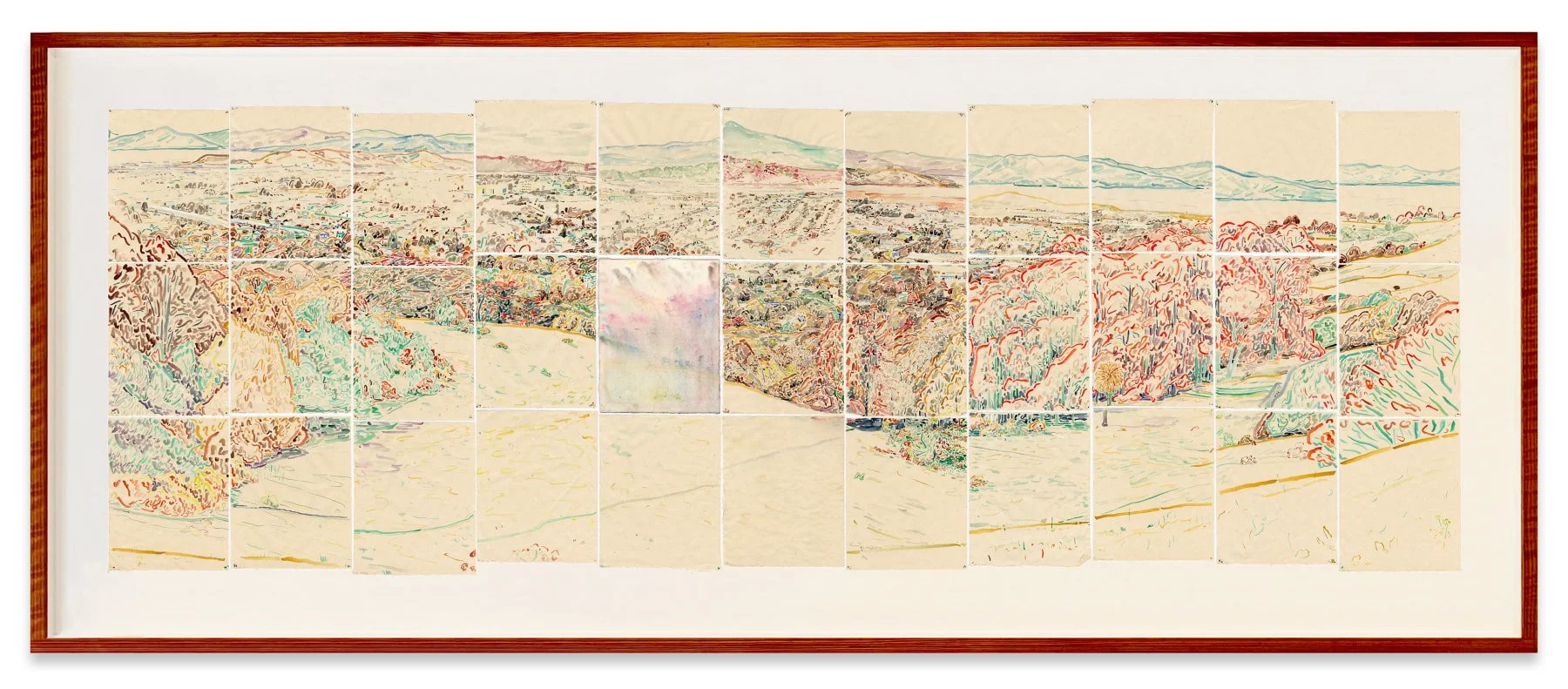
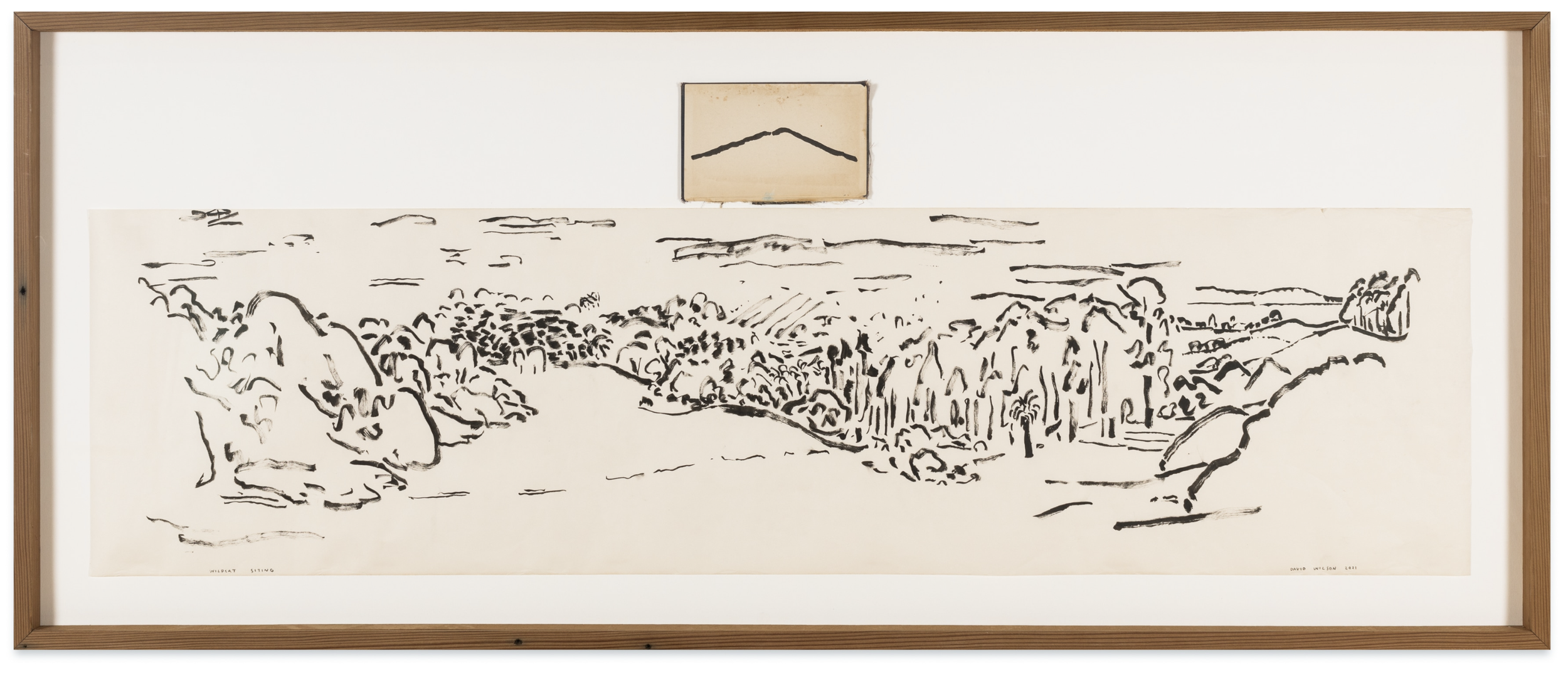
2. David Wilson

I often run into Oakland-based artist David Wilson as he’s climbing the same trail I’m hiking down in the Berkeley hills, carrying his rolls of paper, inks and pencils. He works on-site, drawing what he can capture in a single sitting, often collaging different days’ work together. I love his expressive line, and attention to the places I also love.
3. Rachelle Reichart
Temple visitors performing hand-washing purification in Asakua, Tokyo.
Also Oakland-based, Reichart’s work captures the western landscape by zooming out (creating meticulous drawings from satellite imagery) or zooming in (harvesting San Francisco Bay salt and creating wall sculptures with it.) I love the way she uses delicate materials and processes to yield bold, intense objects.


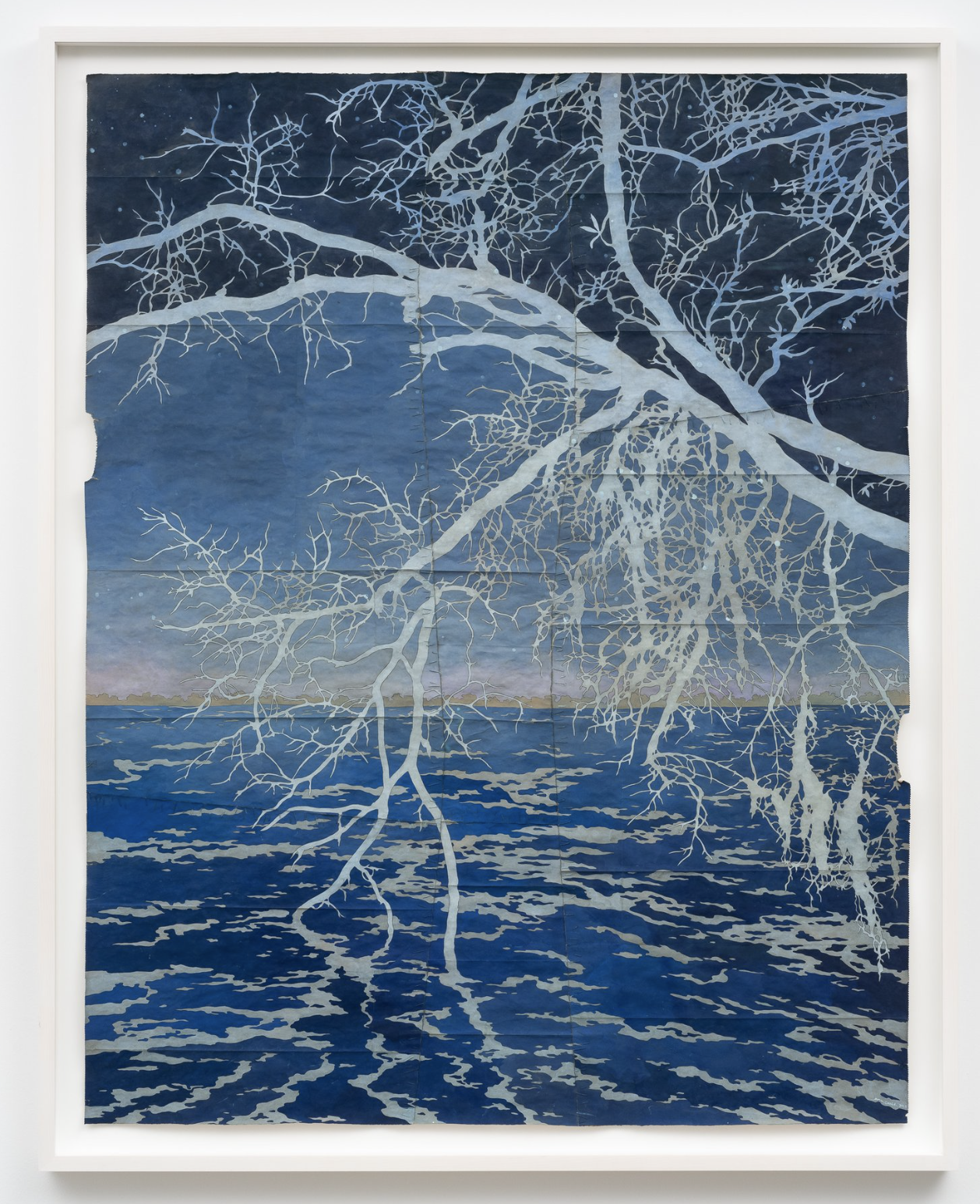
4. Maysey Craddock
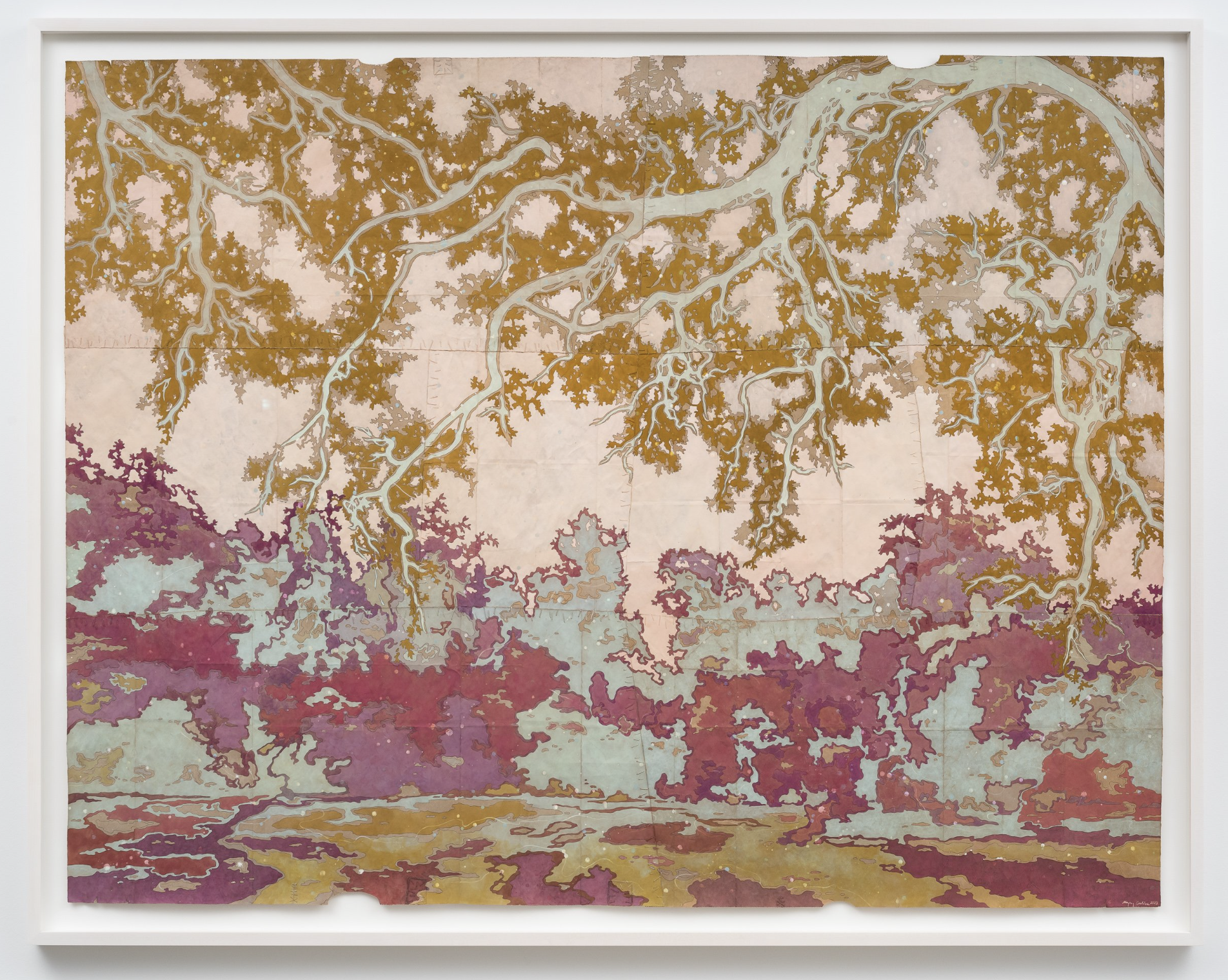
Craddock is a painter who works from her own photographs of fragile landscapes. She works in gouache paint on paper bags sewn together with silk thread to emphasize the ephemeral nature of these shifting, vulnerable places. I love the intricate encompassing patterns and the surprising beauty of the bags-as-canvas.

5. Martin Machado

Born in San Jose, Machado has spent his life as much at sea as in the studio, working as a crew-member on fishing boats and international containerships. His work explores the sea voyage as a metaphor for life’s journey. I love the texture and movement of these works in person.


6. Saif Azzuz

Azzuz is a Libyan-Yukon artist who lives and works in Pacifica, but whose work reflects an indigenous connection to the land’s cycles and seasons, as well as traditions of land management, use, and honoring. I love Azzuz’s work’s vibrant, youthful perspective on a deep land-based heritage, and his insight into places I also know and love.
7. Terri Loewenthal

Loewenthal’s hot, hallucinatory photographs capture the pressure of climate change, and the imperative to preserve the wild spaces that reflect and contain our wildest selves. I love her work because it transforms the landscapes I love into ultraviolet illusions that seem both endless and impenetrable.


8. Afton Love

At her studio in New Mexico, Love’s meditative process includes painting with the minerals in her own backyard, often on surprising materials like silk. I love the pristine calm that her repetitive marks make, almost like listening to a chant or incantation.


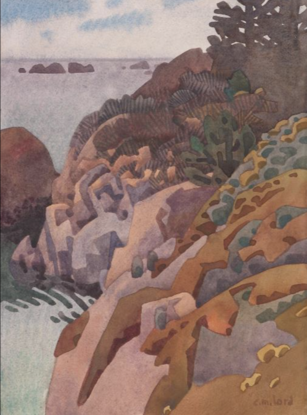
9. Carolyn Lord

Lord works in the tradition of the early California impressionists of the 1930’s-40’s, but innovates into slightly more abstract forms. I admire her brilliant understanding of light and color.

10. Tanja Geis

Berkeley artist Tanja Geis dives and sails in the San Francisco Bay, even venturing out to California’s islands. She closely studies the local marine environment and, often working in charcoal, produces works that focus on endangered plants and animals. I love the soft intimacy of her portraits of these vulnerable yet resiliant creatures. Catch her work now at the Bolinas Museum!


Thanks for reading! For more art inspiration, take a look at our Gallery Guide. I hope your own summer provides the light, warmth, and inspiration to carry you through the rest of the year.

Inspiration | A Trip to Japan
I recently travelled to Japan, visiting Tokyo, Kyoto, and hiking the Kumano Kodo. Through temples, modern megacities, ancient paths, ramen shops and shrines, I marvelled at the aesthetic rigor applied to all facets of life and took note of what made this place feel so magical.

Kiyomizo-dera Temple in Kyoto at sunset.
I recently travelled to Japan, visiting Tokyo, Kyoto, and hiking the Kumano Kodo. Through temples, modern megacities, ancient paths, ramen shops and shrines, I marvelled at the aesthetic rigor applied to all facets of life and took note of what made this place feel so magical. Ultimately, it was the balance of contradictions that opened up the space for my imagination— the coexistence of ancient and futuristic, darkness interwoven with illumination, the sacred within the everyday. There was so much to reflect upon and take home with me. I’ve shared a little with you here.

Ginkaku-ji Temple in Kyoto.

Atop Nanzen-ji Temple in Kyoto (shoes off!)

The preserved home of ceramicist Kawai Kanjiro in Kyoto.
Old + New
Yumekoubou Gallery in Kyoto
Japan’s cultural history stretches back thousands of years, and yet the country is well known for its modernity. What impressed me was the balance of these elements in everyday Japanese life. Ancient shrines are preserved within modern city blocks. People bicycle around town as much as they take the bullet train. Our hotels had tatami mats as well as Toto toilets (I’m a convert). This contradiction comprised much of the magic of Japan for me: a country where the mysticism of the past and the imagination of the future seemed an accessible part of the present. It felt as though the best of both worlds had been perfectly commingled.
The Asakusa Tourist Information Center building in Tokyo, blending traditional timber and modern glass construction.

Old wood and tile buildings shoulder-to-shoulder with modern apartments in Kyoto.

Young women in traditional dress on their iphones in a Kyoto city park during Cherry Blossom season.
Cherry blossoms and modern facades in Kyoto.
2. Shadow + Light

A guest on the way to the onsen.
Lighting is an art form in Japan. Very rarely did we encounter overhead lighting in our accommodations. More often, interiors included lighting tucked away below built-ins, layered with soft lantern light, and sliding screens to modulate the light coming in through the windows. More integrated lighting rippled across textured walls, or bounced off water features in lobbies. In the hallways of one hotel, the only lighting was a spotlight on a wall-mounted ikebana arrangement. At night the cherry blossoms were illuminated from lights placed in the canals, and the temples were lighted to be visible out among the hills, while alleys remained dimly lit by red paper lanterns. While accessibility could present challenges, I found the commitment to such soft, layered lighting to enhance the beauty of cities and spaces, and to create a soft restfulness.
An alley in Kyoto.

Illuminated cherry blossoms above a Kyoto canal.

Our tiny but luxuriously appointed hotel room at the Hotel Resol Trinity in Kyoto.

A living lighting feature in a hotel hallway at the Hotel Resol Trinity Kyoto.

Kiyumizu-dera Temple in Kyoto at night.
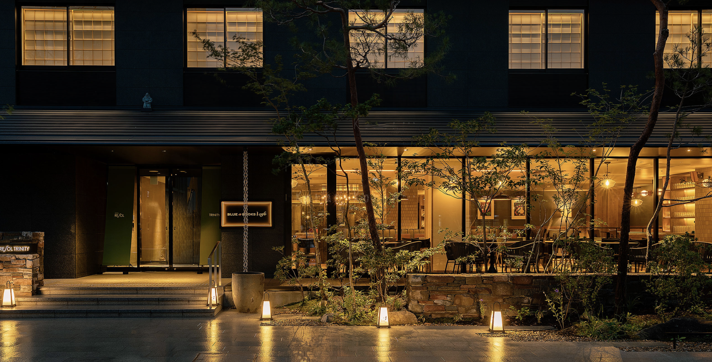
Hotel Resol Trinity Kyoto at night.
3. Everyday Ritual

Temple visitors performing hand-washing purification in Asakua, Tokyo.
So much of daily life in Japan is ritualized. You are invited to wash your hands at the temple, remove your shoes at the threshold of an interior, don clean robes to the bath or to dinner. The prevalence of private and public bathing encourage mindful cleansing routines. These small acts add up to a lifestyle that is lived attentive to every moment as it unfolds in a particular space. The Japanese concept of ma captures the beauty of being present in quiet, everyday moments and places. Commonplace rituals help bring the busy mind back into the body, and an appreciation of the present.

On my way to the hotel breakfast in the provided yakuta and geta.

In-between spaces, such as passages and paths, are carefully designed.

The onsen at Soraniwa Terrace Hotel in Kyoto.
A Japan-inspired Mood Board
So here’s what I’m dreaming of now—wabi sabi ceramics, delicate low light, hand-hewn wood surfaces, and bathing rituals…

If you’re inspired to get the look yourself:
Cedar wall panelling
A small space soaking tub
A chiselled-texture wooden door
Paper lanterns from an iconic Japanese designer
A vase for ikebana arrangements
Tile inspired by flowing ink
Artisan-crafted wooden furniture that may as well be sculpture
Thank you so much for reading… arigato gozaimazu!

Holidays the West Coast Way
I’m hosting Christmas for the very first time this year, and it has me thinking about the kind of traditions I want to create and pass on. Coming from a family of diverse backgrounds all strongly rooted in the west coast (fifth-generation Californian here!) I want to celebrate in ways that express my gratitude and love for this place and its rich culture.

My grandparent’s old Russian River property, where I’ll be hosting Christmas this year.
I’m hosting Christmas for the very first time this year, and it has me thinking about the kind of traditions I want to create and pass on. Coming from a family of diverse backgrounds all strongly rooted in the west coast (fifth-generation Californian here!) I want to celebrate in ways that express my gratitude and love for this place and its rich culture. Here’s a few festive ideas that are already a part of our holiday rituals or that I want to try this year—each a pleasure that feels like home to me.

1.
Golden State Garlands
Taking inspiration from your local green space or even your backyard, these garlands include dried citrus and persimmon, along with bay leaves. I can only imagine the fragrance!
I’m going to follow Emily DaFoe’s recipe for dehydrating the fruit, then let the whole family help string them together while we listen to music.

2.
Wreaths of Coastal Greens
Instead of evergreens this year, I want to make wreaths with the kind of silvery greenery that reminds me of the coast—olive, eucalyptus, and sage. Marcy Mussari has a nice tutorial if you are DIYing for the first time.

3.
California Nuts
This one is sentimental for me—my family always put out bowls of in-shell nuts from the central valley at Christmas. While the tradition of nuts at Christmas originated as a Victorian luxury, for us they were simply a reminder of the bounty produced by the hardworking farmers my grandfather and dad worked with in their small produce distribution business. As a treat, they’re a nice break from all the sweets, and as kids, we had so much fun using the nutcracker to crack our own.

4.
Magnolia on the Mantel
Magnolias may not be California natives, but they’re still an iconic presence in many California neighborhoods. I love them for the rich velvety brown of the leaves’ undersides. You can usually pick them up from Trader Joes, and they dry beautifully, lasting a whole season.
design: Amber Interiors

5.
California’s Midcentury Craft Movement
As a lover of midcentury ceramics, these incredible candle-holders, from Sausalito-based ceramic icon Heath, caught my eye. If mid-century is your style, you don’t need to deviate from it just because it’s the holidays. Instead, invest in pieces that feel true to you as you pull them out year after year.

6.
Spanish-inspired Iron
The drama of ironwork is perfect for Christmas, and recalls all the Spanish splendor that influenced so much of design here in California. I love the bold statement of this Menorah by Josh Owen and am eyeing this wrought iron candelabra for my own table.

7.
Christmas Tamales
In my family, Christmas Eve is for Mexican food. Traditional for Christmas, tamales are such a crowd-pleaser and we have made them (turn it into a party!) as well as ordered them, depending on how much bandwidth we have that year. Another favorite is an old California classic, Tamale Pie (this recipe looks good!) which we serve with a side Fritos just to take it over the top.

8.
Tequila Spiked Cider
And to go with the tamales? What could be better than tequila? This recipe from Half-Baked Harvest is spiced cider baja-style. I’ve been making a version of these since I hosted my first holiday party, cooking a batch up on the stovetop and letting the smell fill the house as it simmers. Float some orange slices and anise stars on top, and let guests ladle it up and garnish it as they please. So festive.

9.
Seafood Soul Food
Our new favorite special occasion dish is a San Francisco original—cioppino. It’s easy, beautiful, and celebrates the coastal bounty here in the Bay Area. We follow this recipe and serve with the miche bread from Fournée Bakery in Berkeley. Perfection.
For Christmas brunch, this year, I’m thinking of Ina Garten’s Crab Quiche if crab season opens early enough.

10.
A Mediterranean Dessert
Fruit deserts are a favorite in my family. My grandmother made persimmon pudding and pear pie from the persimmons and pears she grew, and my mom makes an incredible cranberry almond tart.
I’ve been trying to develop my own signature fruit bake—something light and fresh that’s just as good for breakfast on Christmas day as it is after Christmas Eve dinner. I love the bright color and the snowfall of powdered sugar on this orange olive oil cake—something like this feels beautiful, special, and just right for a west coast Christmas.
I hope this post has you looking forward to your own traditions or dreaming up new ones. I am wishing you all the comforts and joys of home and family this holiday season. Thanks for reading! I look forward to sharing more in the new year.
Five Ways to Reinvent Your Fireplace
Fireplaces are possibly my favorite thing to design (like the one from this project which has gone absolutely viral on Pinterest) because they provide a blank canvas that can become a focal point for the home that expresses its point of view and personality. This is a design element to consider in terms of mood or emotion—do you want your home to be fun and playful? Or romantic and elegant? Cerebral or passionate . . . read on to learn how to encourage a fireplace's main character energy.

It’s finally fireside season! While you spend time in front of yours, or just dreaming of your future fireplace, I’m here to encourage you to dream big.
Fireplaces are possibly my favorite thing to design (like the one from this project which has gone absolutely viral on Pinterest) because they provide a blank canvas that can become a focal point for the home that expresses its point of view and personality. This is a design element to consider in terms of mood or emotion—do you want your home to be fun and playful? Or romantic and elegant? Cerebral or passionate?
Once you’ve identified the feeling you want to convey, you can select materials and forms that speak in that register. I recommend getting creative and going bold when it comes to fireplaces because they are a great place for a design element that stands alone and can do a lot of the talking for the rest of the house. Here are a few ideas to encourage that big main character energy.

1.
Play with Plaster
Plaster has made a comeback recently in many new finishes and colors because it’s a material that allows for so much creativity. Here’s a few ideas to consider:
Select colored plaster in moody hues
Form arcs, curves and reliefs: sculptural forms cohere beneath a plaster finish
Opt for movement and texture in your finish application
Swath an entire facade in one serene color or mix colorful plaster elements with equally interesting tile or stone.
Design: The Brain and the Brawn


2.
Rethink Brick
A brick fireplace is a common classic, but don’t count brick out if you want to make a bold statement. Here’s a few ways to rethink it:
Apply different patterns to one facade for a custom yet classic look.
Consider some asymmetry to modernize the material.
Carry the brick onto adjacent walls, hearths, and other architectural elements for a feature wall finish.
Install brick vertically for a modern take on a traditional material.
Design: Webber + Studio


3.
Let Stone Speak
Stone is a venerable fireplace material, possibly the oldest one, but a new perspective can still yield exciting results.
Colored stone offers fun and bravado
Don’t discount the drama of a slab, whether at the hearth or framing the firebox—the more rustic the better.
Modern shapes and asymmetrical forms can be a great balance against this old-world material.
Design: Rudolph W. Schindler


4.
Tap the Creativity of Tile
Tile provides the easiest way to pack a punch. Here’s just a few ways to use it to make your fireplace a statement piece:
Go bold with color, even or especially in contrast with the rest of the room. Why should your fireplace blend in when it’s perfectly positioned to stand out?
Embrace iridescence (as in the case of zellige) or even metallics. There are so many cool tile finishes in gunmetal, gold, and mercury right now.
Use patterned tile as an accent—adorn a hearth, or the inside of a firebox with something surprising and special.
Design: Jessica Helgerson


5.
Take a Twist on Traditional
There’s nothing like a traditional mantel to gather around. But a non-traditional treatment can elevate it into an artful experience.
Strip an old mantel whose character has become coated in too many layers of paint to reveal its elemental warmth.
Conversely, a bold paint choice can give an old mantel new life.
Interpret traditional forms into new materials for a look that is fresh and playful yet honors the past
Design: Matt McKay


Thanks for reading! I hope these ideas give you something exciting to dream about on cozy nights spent staring into the flames of a lit hearth.

My Favorite (Surprising) Styling Trick
I once read an interview with an English designer who declared that every space needed something ‘vulgar,’ and I understood immediately what she was speaking to. Every space needs some contrast, some frisson, in order to sing. While there are any number of ways to create this beautiful friction, I have a favorite, and I’m willing to share . . .

design: Jacobson Arquitetura
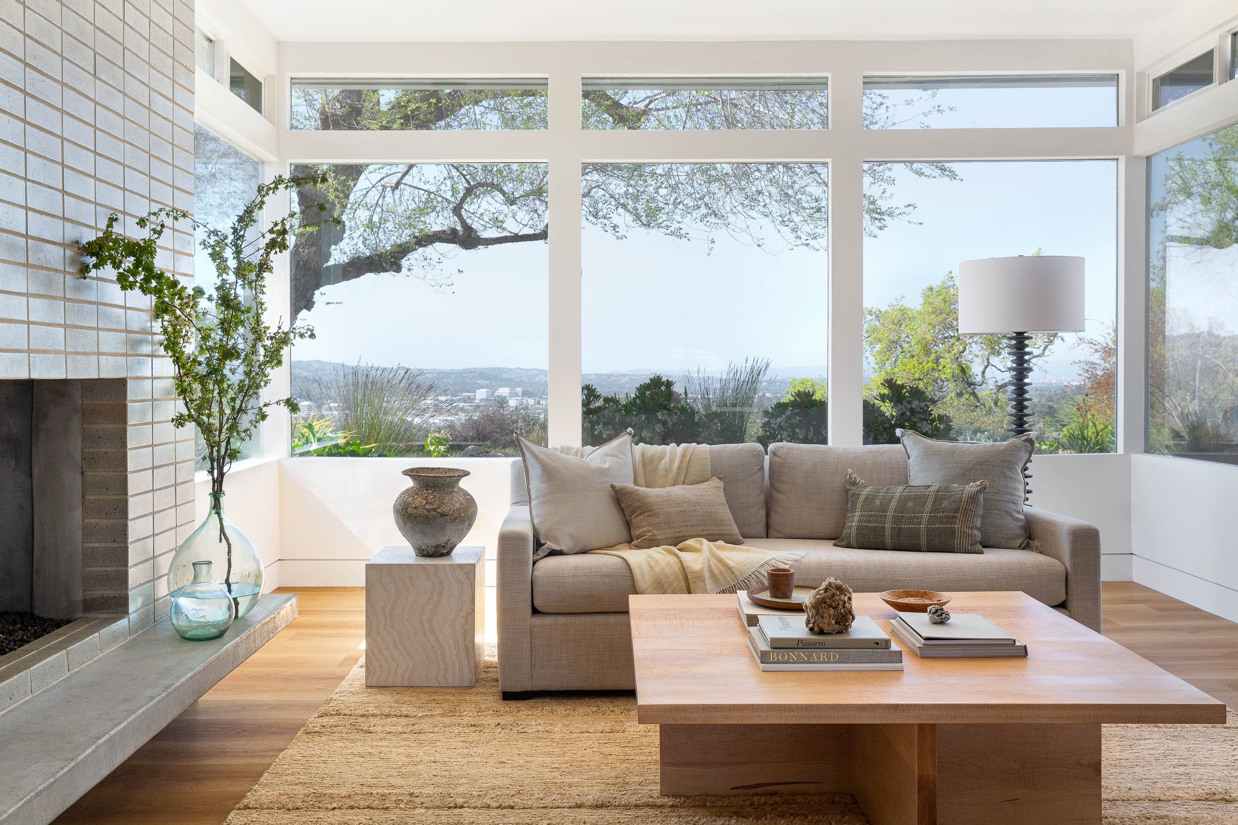
Take a look at this room. It’s envy-inducing—those windows, that sliding glass door system, the floating fireplace, the vintage chairs, the clean lines!
You might be surprised where my eye goes among all this beauty. That’s because I’m always looking for what makes a space come alive, and often enough it’s not the most expensive or luxurious elements. What can really make a space come to life is the way a bit of contrast can highlight those elements, creating unexpected interest that ultimately adds up to character.
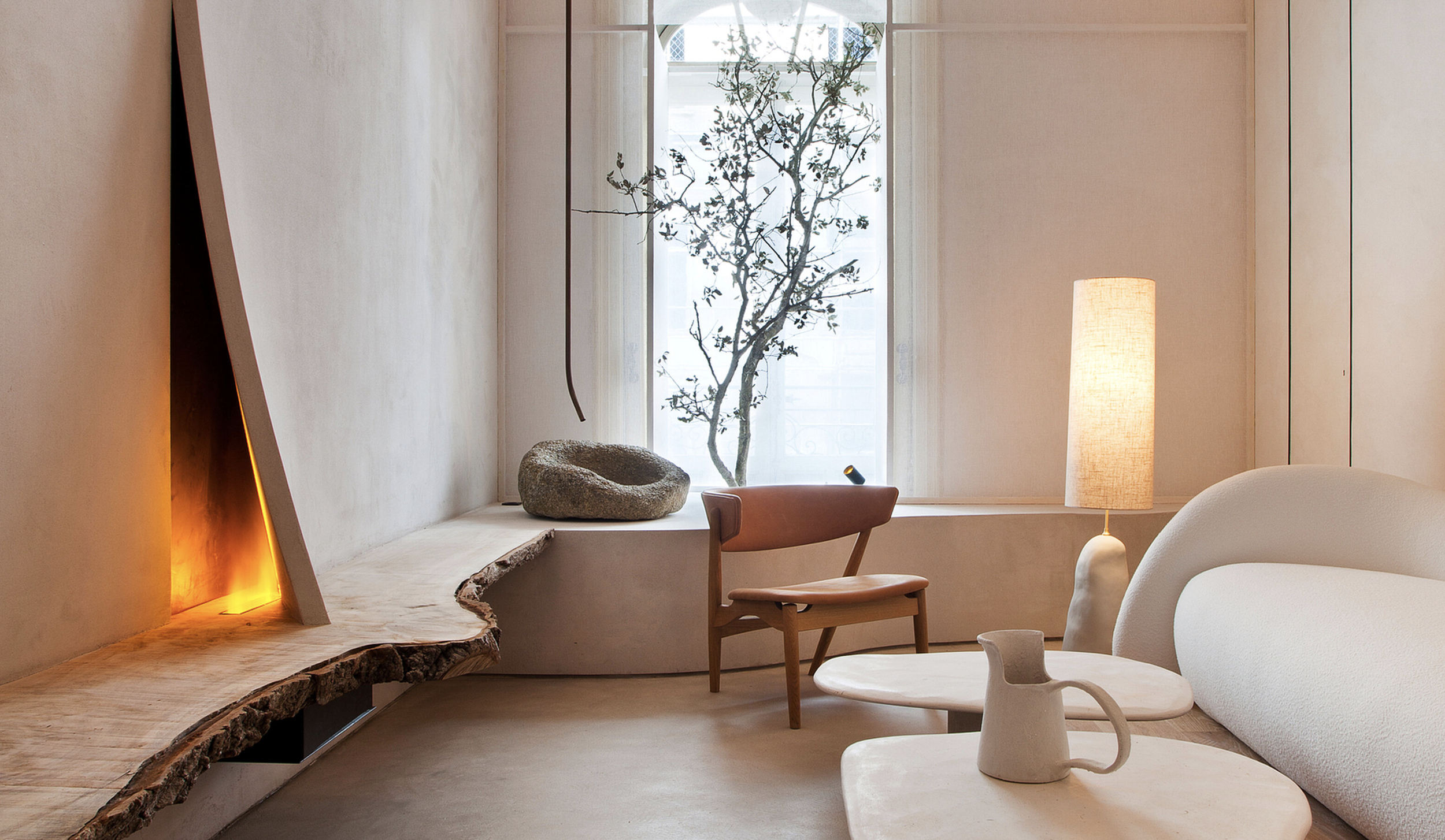
While there are any number of ways to create this beautiful friction, I have a favorite. In every space, I love to add something rustic. And by that I mean something hand-hewn or heavily patinated, something you might find washed up on a beach or left out on a curb. Clients can balk, but they are always won over when they see it in situ.
Have you found the ‘something rustic’ in the above photo yet? That’s right—it’s the distressed wooden bench in the foreground. That bench is doing some heavy lifting. Without it, the space becomes a bit more expected, almost one-note. In fact, I bet if you look through your own design inspiration now, you’ll start seeing the ‘something rustic’ quite often. I hardly invented the idea, but I get so much joy implementing it. Read on to understand how it works, its origins in design, and how you can exercise its magic in your own home.

1.
The“SomethingRustic”
Trick: Why Does it Work?
I once read an interview with an English designer who declared that every space needed something ‘vulgar,’ and I understood immediately what she was speaking to. Every space needs some contrast, some frisson, in order to sing. A meticulously designed space in which every element is aligned simply doesn’t speak to, or invite in, the human. And our spaces are meant to be human, to be be lived in and to live themselves. They need to be touched by time and the elements, curated by human curiosity, and capable of mystery and contradiction.
Go ahead and place your hand over the blackened wooden stand and its earthenware jar in the opposing image. You’re left with a lovely bathroom—with no character. By contrast, the ‘something rustic’ makes the soft clean surfaces of the bath feel more necessary and appealing than they might on their own.
design: Lindsay Gerber Interiors

2.
What are the Roots of this Aesthetic?
The Japanese concept of wabi sabi perhaps best captures the profound and rich expression of rustic elements. The term translates to austere beauty (wabi) and rustic patina (sabi). The celebration of a wabi sabi aesthetic in traditional Japanese arts (such as naturalistic Ikebana flower arranging, cracked and irregular ceramics, and rock gardens) emphasizes and embraces the impermanence and imperfection of life. Learning to find joy and peace in life’s natural form is the practice of wabi sabi.
design: Betsy Brown Inc

3.
How to Source Wabi Sabi
Of course, a love of the rustic can be found in many creative traditions, and is native to many design styles. You can find interesting rustic elements in nature, at flea markets, or antique shops. I keep a lookout for the following textures and materials:
• Rusted metal
• Peeling paint
• Textured ceramics
• Driftwood or reclaimed wood
• Patinated brass
• Tarnished silver
• Foxed mirrors
• Asymmetry or organic forms
• Worn handmade textiles
• Found objects from nature like shells, nests, and rocks
design: Cassandra Ellis

4.
How to Style it
When it comes to styling, wabi sabi elements pack the most punch when in contrast to cleaner lines or more tailored furnishings. Opposite, you can see how a burl wood table set gives idiosyncratic charm to a traditional room. Think also, of how beautiful every exposed stone wall in every modern European renovation looks. It’s tension and contrast that create liveliness. Here’s some ideas for pairings:
• A reclaimed wood coffee table with a sleek modern sofa
• A vintage milking stool on a refined marble hearth
• A wabi sabi vase on a DWR table
• A seashell collection in a trimless window sill
• A piece of driftwood mounted above a midcentury door
• A patinated brass lamp on the counter of a modern kitchen
• A vase of tall branches in the corner of a minimalist bedroom
design: Jane Hallworth

5.
Trusting the Process
Take a look at the photo opposite, from our Modern Drama project in the Oakland Hills. When the client originally received the large wabi sabi vase, she wanted to return it, citing a ‘moldy appearance’ and crumbling glaze. Always happy to please my lovely clients, I refunded her and took the piece back, bringing in onsite again for the project shoot. When the client saw the same vase she had rejected styled on her her sleek corner table, amid her silk drapery and rug, she asked to buy it back.
All this to say—even if the rustic object is itself outside your comfort zone, I recommend having some fun styling it with diverse objects to really understand its effect. You might surprise yourself.
If you’re so inspired, here are a few objects I think would serve as a beautiful counterpoint to any elegant space. But shopping isn’t always necessary—you may just find your own ‘something rustic’ on your next walk.
Take care,
Elizabeth

1. 19th Century Butcher’s Table, Elsie Green
2. Barnacle Vases, Anthropologie
3. Antique Naga Table, Patina Maison Shoppe
4. Ceramic Lamp Shade, Gapasso Ceramic
5. Antique Stool, Ceasar’s Living
6. Lyon Silk Trader’s Cabinet, Elsie Green

Inspiration | A Trip to Spain
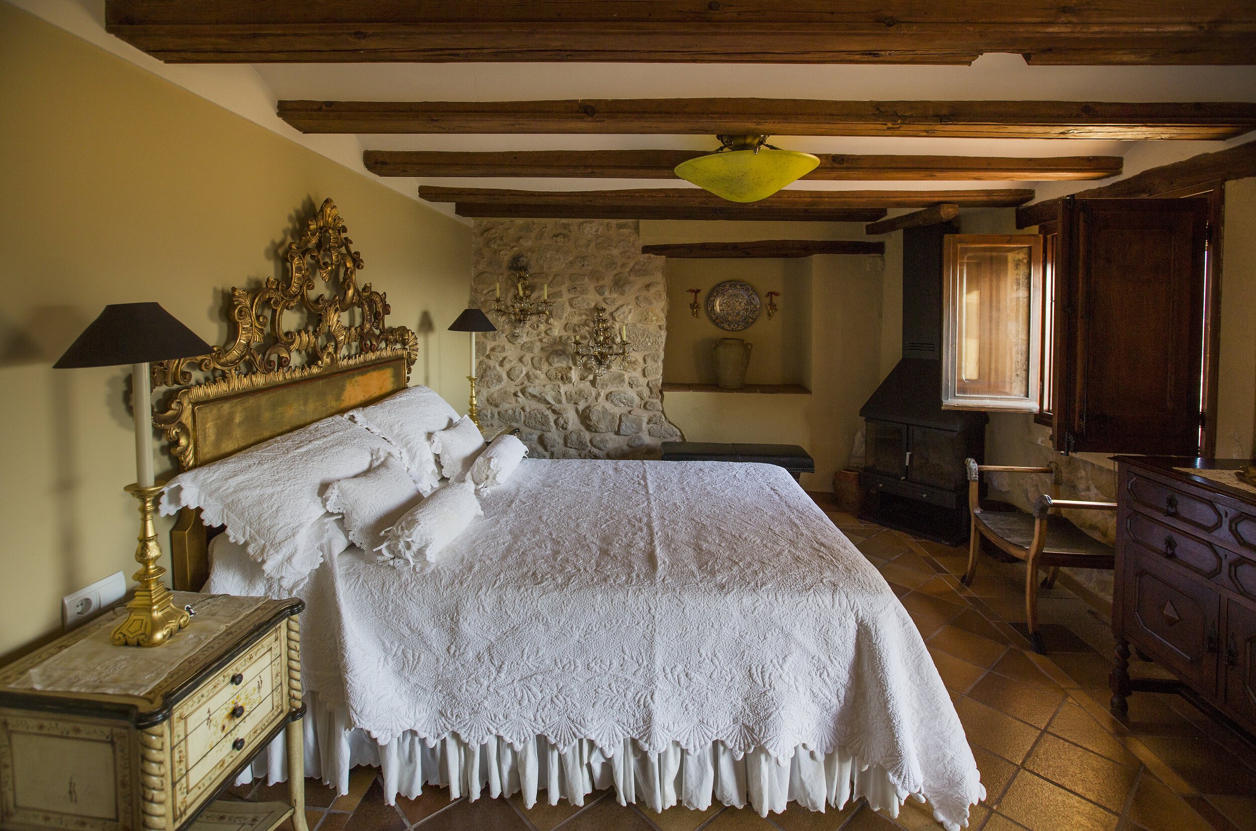
About twenty years ago, my aunt and uncle purchased an old (village rumor puts it at about 800 years old), dilapidated home in a small village south of Barcelona. In the next decade, they renovated it to luxury standard and furnished it with art and antiques, producing a one-of-a-kind vision the delights all who come to stay. This summer, I visited for the third time.

About twenty years ago, my aunt and uncle purchased an old (village rumor puts it at about 800 years old), dilapidated home in a small village south of Barcelona. In the next decade, they renovated it to luxury standard and furnished it with art and antiques, producing a one-of-a-kind vision the delights all who come to stay. This summer, I visited for the third time. Needless to say, it continues to inspire me. I thought I’d share this magical home here, along with few other special Spanish spaces we visited.
My Aunt’s Home in Terra Alta, Casa Rumbet

Let’s just start at the top—here is the view from the fourth floor primary suite. As you can see, my aunt and uncle opened up the attic roof to create an on-suite terrace with views of the magnificent countryside. La Terra Alta is known for its red rock formations, olive groves and vineyards, and medieval hilltop towns like this one, Horta de Sant Joan. This terrace is the spot for afternoon cocktails, casual dinners, and stargazing.
Now that you know where you’re headed, let’s take a leisurely tour through the rest of the home . . .
The entryway features Moroccan lighting and prints by a family friend.

Many of the Spanish antiques in the home were actually sourced in Marin and repatriated via shipping container, as Spain doesn’t have the kind of flea markets that France does.

All ironwork was forged by my uncle, artist Reynaldo Terrazas.
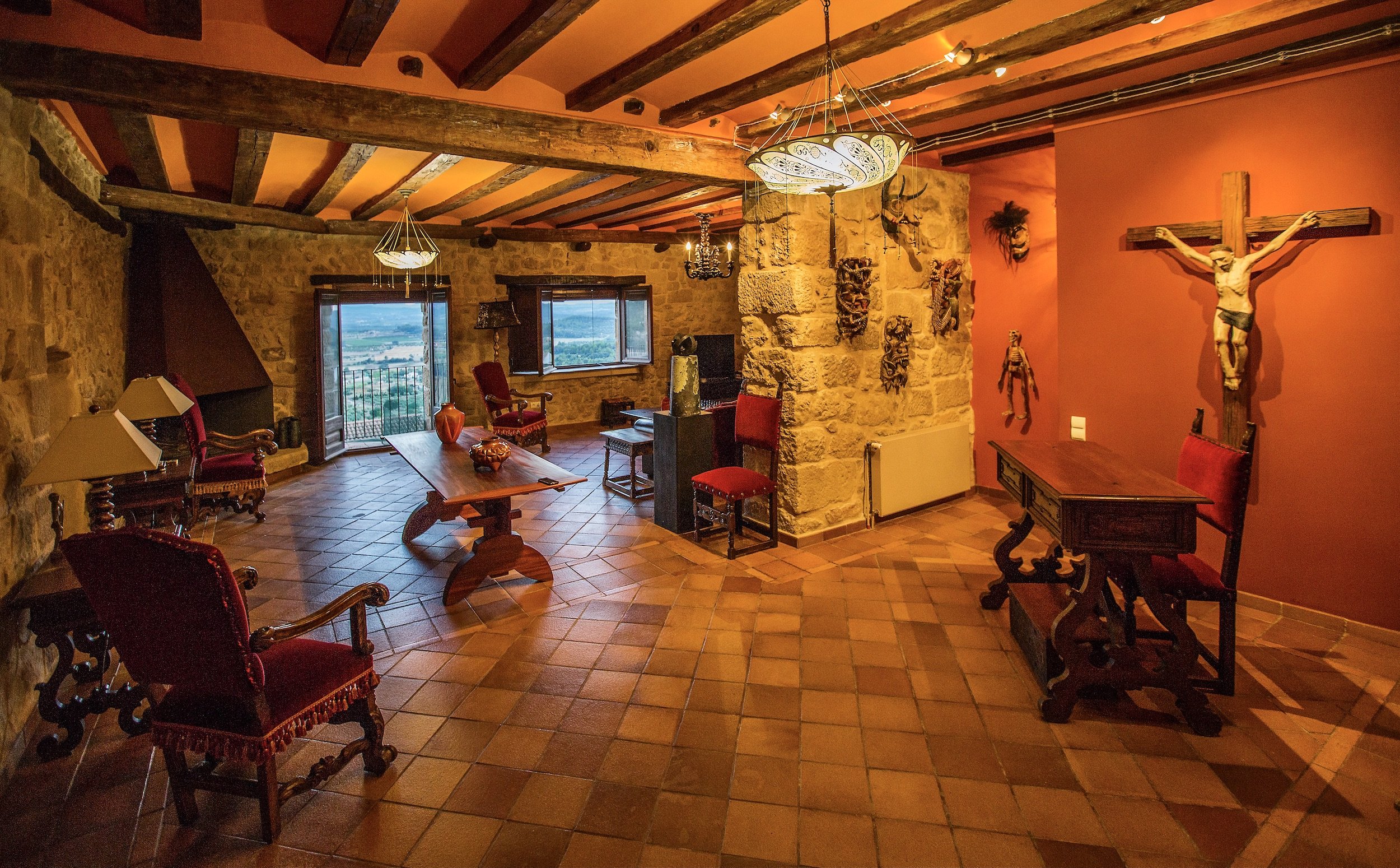
La Sala (the living room) features a collection of Mexican masks, Spanish antiques, and modern woodworking by Bay Area artisans that are family friends.
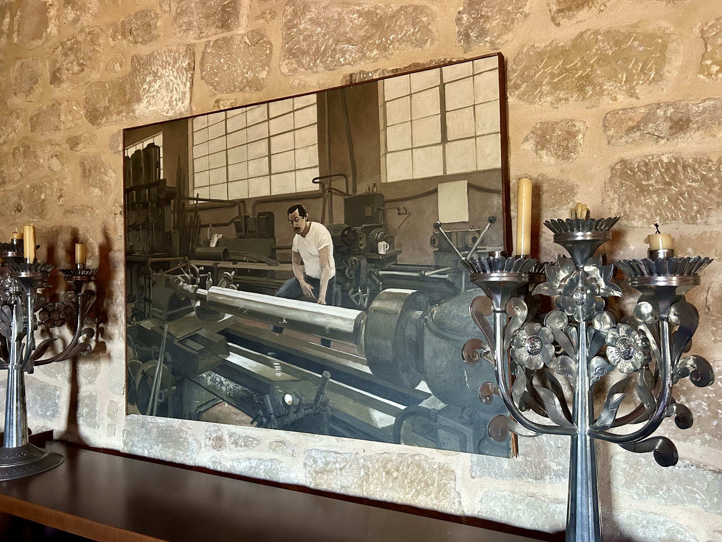
A large console table features Mexican candelabras and a portrait of my uncle in his metal shop in Oakland, where he created architectural finishes, sculpture and artists’ printing presses.

Curtains fashioned from antique lace let in light from the narrow medieval streets.

La Señora herself, my aunt Jody Terrazas. We are on our way to enjoy drinks in the plaza.
As my aunt will tell you, renovating a home abroad is an adventure. She and my uncle had actually envisioned warm white walls throughout the home, but when they arrived to see the work the artisan plastering crew had done, they were shocked but (not immediately but very quickly) delighted to see the bold color choices that were indelibly applied to their home’s interior walls. The kitchen/dining room also features the home’s original fireplace and a new graciously arched window.

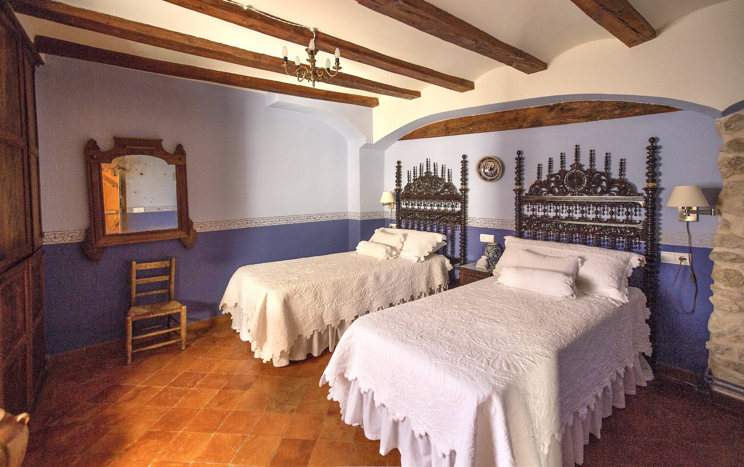
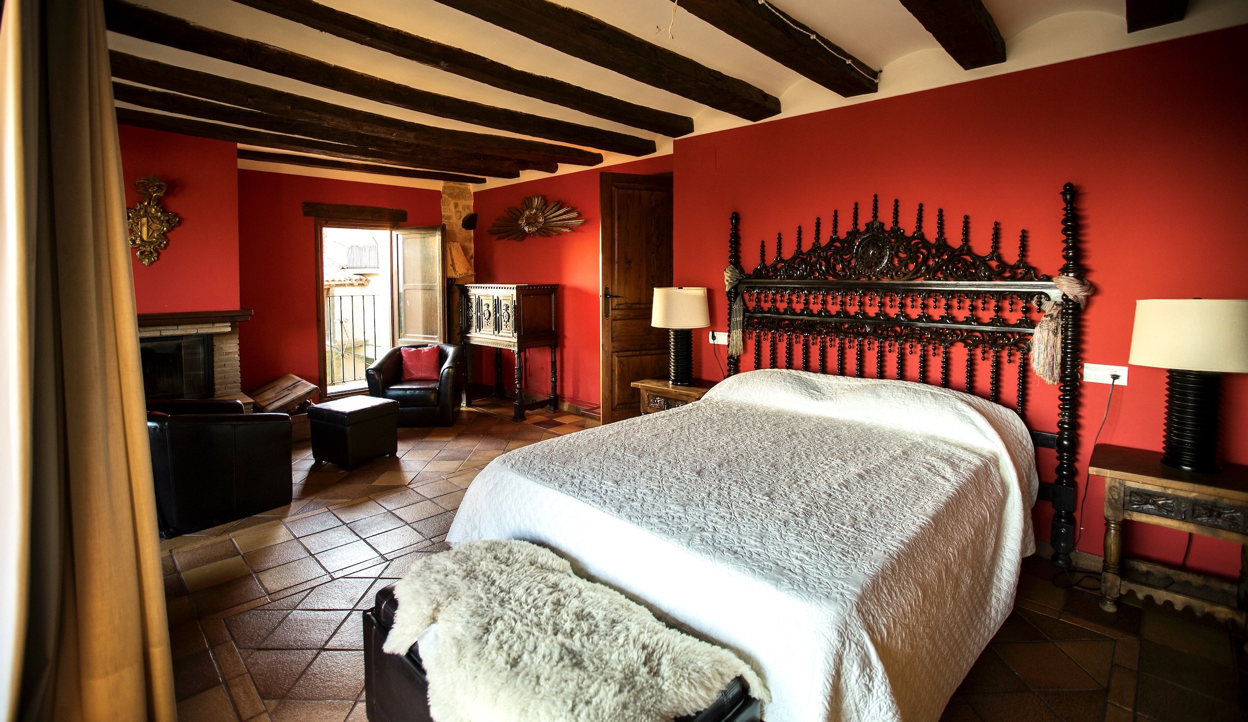
Each of the three guest bedrooms has its own charms and unique character. This time, I stayed in the ‘gold bedroom,’ below left, and woke each morning to a real-life Renaissance painting as the sun crept over the landscape and swallows dove through the air. A second guest room features all original stone walls. The kids room is decorated with whimsical blue stencil-work.


The primary suite, as I’ve mentioned, is on the top floor and opens out onto the terrace. It also has a cozy fireplace for wintertime. Its bath is a mix of modern luxury and antique character. My uncle passed several years ago, but my aunt returns at least once a year to enjoy the home they created together as a labor of love and creative collaboration. She enjoys a community of expatriates she considers close friends, and knows all the good local spots to eat and drink. But mostly, being in Spain is about slowing down and truly enjoying the basic pleasures of life—a drink in the plaza, chats with the neighbors, a walk to the local market. I’m just so lucky to get to visit.
If you’d like to learn more about Casa Rumbet, or inquire about renting it out, visit www.casarumbet.com for more information.


Another view from the terrace onto the village of Horta de Sant Joan.
2. Artist Salvador Castillo’s Off-Grid Studio + Home

While staying with my aunt, we were treated to a visit with her dear friends, artists Salvador Castillo and his wife Merce, at their home studio in the nearby countryside. While Salva and Merce live most of the year in Barcelona, they retreat often to this minimalist off-grid sanctuary right on the border of the Terra Alta parklands, in an old olive grove.
The home is powered by solar panel, and its grey water systems are fed by a cistern. All the couple’s drinking water is brought in from a local village well available for use by residents.
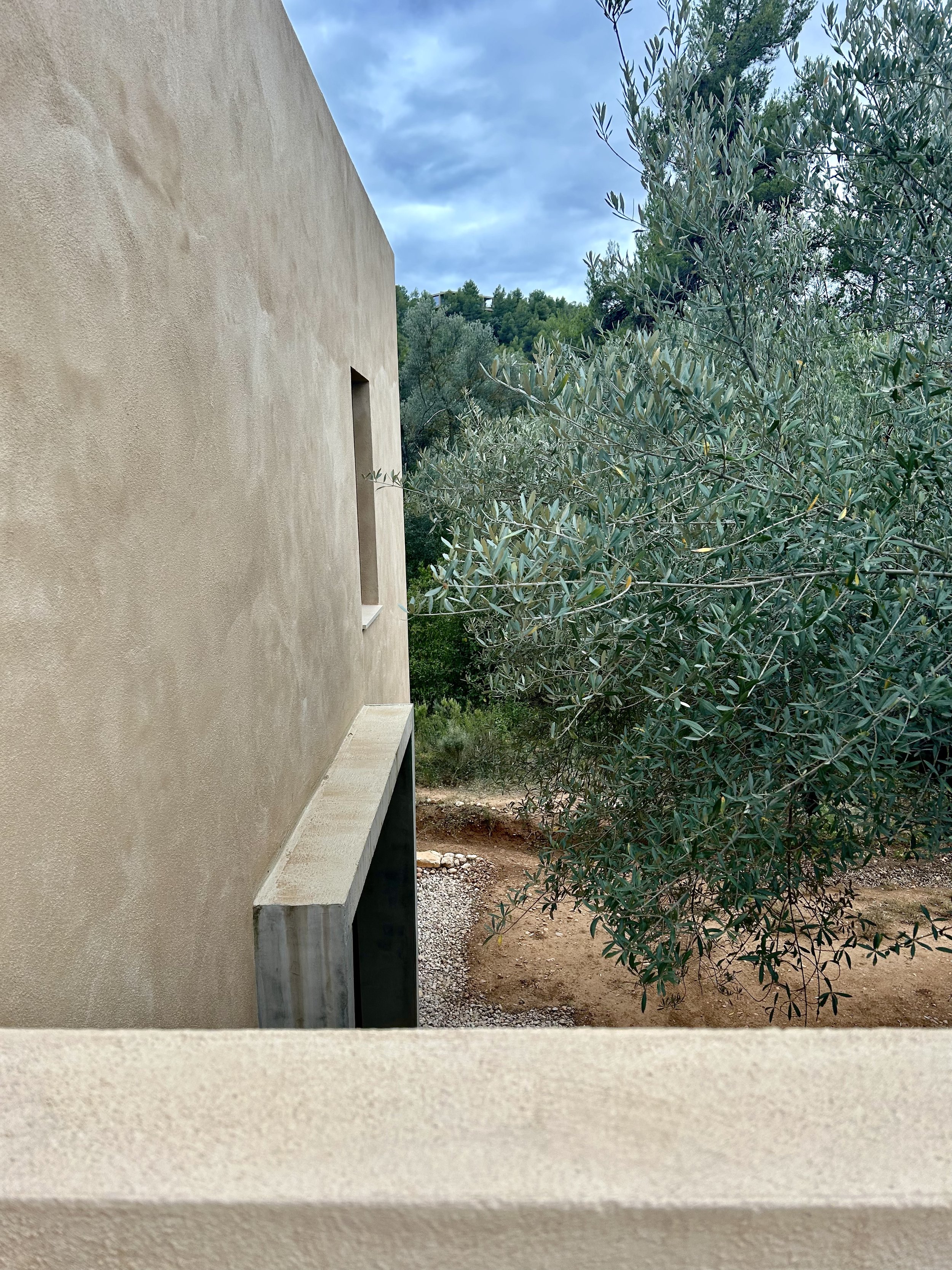
The home’s exterior is composed of an earth-based plaster pigmented to match the surrounding land.

The house was sited to frame views of local geologic landmarks from its windows, as in this guest room.
Half of the home can be sectioned off from the other half, in case the couple decides to retire here later in life, and house family or a caretaker in one half of the residence. Currently though, this second half contains Salvador’s art studio—a serene workspace for the creation of his otherworldly paintings and prints.


The living quarters are spartan, inhabited only by the couple’s most meaningful objects, and each one has a story. While visiting, we were treated first to wine in the olive grove, then lunch inside. Salvador served a stew of medieval origin that he learned from his mother. We were entertained by a visit from the local family of red foxes.
3. Gaudi’s Nature-Inspired Architectural Fantasies

The beauty of Antoni Gaudi’s architecture isn’t exactly a secret, so while the following content may not be entirely novel, I can’t help but share and reflect on its power. The Castalan architect ushered in an era of modern architecture that necessitated innovations in all building crafts—including ceramics, woodworking, stained glass, and ironworks—just to meet the brilliant man’s vision. As an artist, I absolutely marvel at someone who could envision with such intricacy worlds that were so far beyond the reality of his time (the architect was born in 1852).
While Spanish architecture and design had previously been remarkable for its over-the-top Baroque flourish, Gaudi’s love of nature infused and revolutionized this characteristic extravagance, marrying religious traditionalism with modern scientific wonder in a style that expressed the beautiful contradictions of a specific place and time.
I first visited La Sagrada Familia, Gaudi’s nature-inspired modern cathedral in Barcelona, 20 years ago. It has been under constructions since 1882, and it was amazing to see it just a year from completion now. I always feel like a bug looking up at a field of daisies and dandelions at sunset when I am inside.

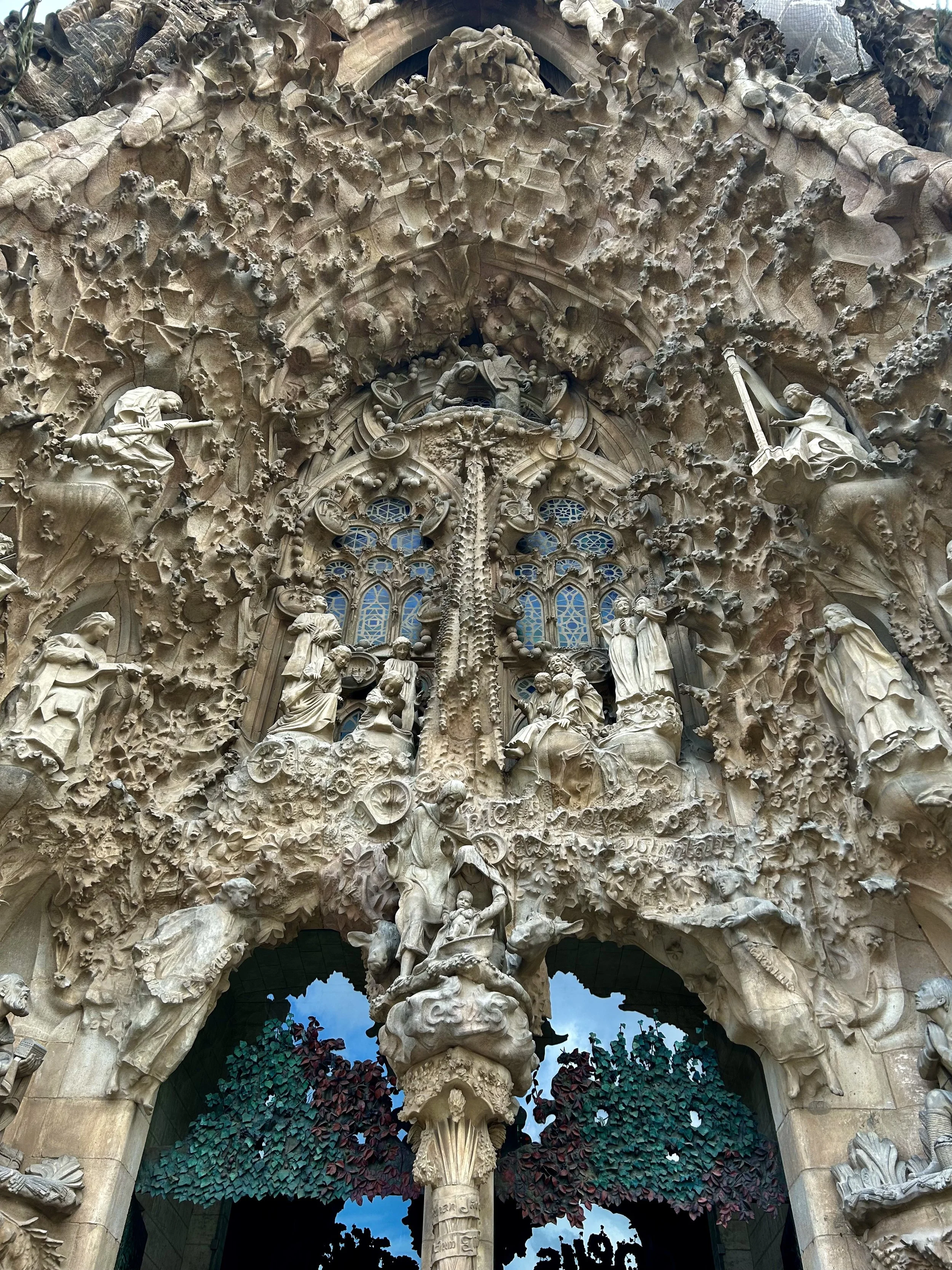
The intricate fractal-like facade of La Sagrada Familia.
A detail of the ironwork on the cathedral’s central doors.
On a smaller scale, Casa Batllo offers Gaudi’s vision of modern living for a single wealthy family, and is a testament to what can be achieved when a client gives a creator carte blanche. Made to evoke the sea, every line in Casa Batllo is a wave, the space undulating around the inhabitant in gentle ripples. Jeweled light floods the interior through bubble-shaped stained glass. But the apartment is no fishbowl—the hand-carved wood and glass doors of its second floor living room were designed to open up completely to the conviviality of the street outside.
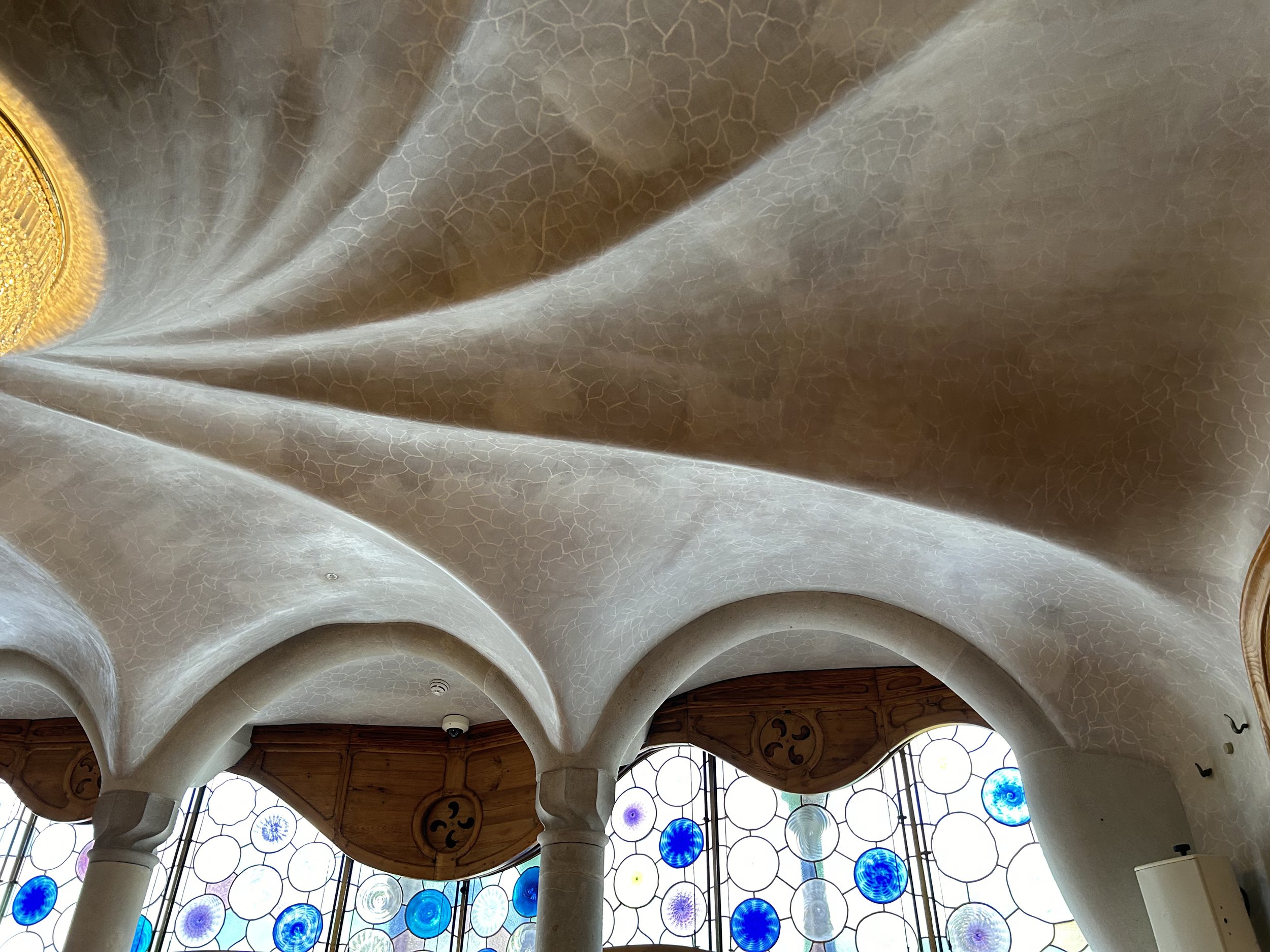
The ceiling of Casa Batllo’s living room.

The central stairway rises like a spinal column through the building.

A central airway is clad in tile resembling scales or sea stars.


As I walked through Gaudi’s spaces, enraptured to his unabashed mimicry of nature, I couldn’t help but think that the organic minimalism beloved by designers today (myself included) might be enlivened by a dose of organic maximalism. These exquisite buildings, and everything I’ve shared here, are a reminder that timeless, iconic style is crafted from a commitment to one’s passions, and the willingness to look far beyond the here and now toward something only you can bring into being for the very first time.
A Spain-inspired Vision Board
So here’s what I’m dreaming of now….some imported Spanish drama curated in a an elemental, undone style perfect for California. I’ve included some notes and sources below.

Plasterwork and limewash walls don’t need to be neutral. I’m loving passionate, earthy reds and mysterious greens.
My aunt has plates mounted like artwork on walls throughout her home. The ones pictured above are late 19th century Spanish Labrillo.
Terracotta, anywhere forever. The pendant light is from L’Aviva Home and the tiles are from Clé.
Moroccan influences are everywhere in Spain, where the Moorish kingdom preceded the Catholic one. These lanterns are a perfect touch.
Bold, dark finishes like leather and iron are essential to Spain. These vintage chairs bring that intensity.
The Spanish love to gild the lily. I can appreciate a burnished gold accent with some patina, like this gorgeous antique mirror.
This seashell tile from Clé feels like an updated homage to Gaudi himself. I’m dying to install it in a bath in combination with some blue-green marble. Who’s in?
Thank you so much for joining me on this design-driven summer sojourn to Spain!
Adios + take care,
Elizabeth

Five Ways to Style your Bed for A Refresh
Updating your bed’s styling can be an easy way to make your home feel newly fresh for the season. To that end, here’s a bit of inspiration, with easy ways to get the look . . .

Moore House Design
If you’re the kind of person who likes to switch out your flannel sheets for cotton ones around this time of year, this might be your moment to take things a step further. Updating your bed’s styling can be an easy way to make your home feel newly fresh for the season. To that end, here’s a bit of inspiration, with easy ways to get the look.

1.
Add Textiles to Your Headboard
While working with a designer to source fabric for a custom headboard is the most luxurious way to apply this idea, it’s not the only one!
You can easily drape a vintage textile, special fabric, or even a blanket or tapestry over a wooden headboard for an exiting new accent. And if your headboard is already upholstered, you may be able to use a staple gun to easily apply a new fabric over the old, either over the entirety of it, or in an artful swath, leaving the edges of the existing fabric to peek out in contrast.
Design: Kelly Wearstler


2.
Suggest Architectural Detail with a Folding Screen
Screens add dimension and texture, and can be placed behind an existing headboard or replace it completely!
Look for vintage folding screens or purchase a simple one and wallpaper it. This is such an easy way to transform your bedroom.
Design: Sarah Sherman Samuel


3.
Consider a Well-Placed Ruffle
All things Grandma-chic and girlhood-adjacent are trending right now, and if this appeals to your nostalgia, there are some lovely updated options to try.
A ruffled accent pillow or bedskirt is completely low risk and a darling warm-weather accent. Or you can go all in with a drapey bedcover and ruffled shams. I love this look for adding softness to a minimal space, or charm to a rustic one.


4.
Mix it Up with Contrasting Accents
This one takes a little creativity—look at what you currently love in your bedding and add an unexpected element.
If your bedding is minimal, add a patterned throw or beribboned pillowcase. If it’s linen, add velvet. If it’s neutral, add some colored sheets for a surprising detail. Rich interiors are rarely one-note, and its the unexpected that often enlivens a space.
Design: Studio Gutgow


5.
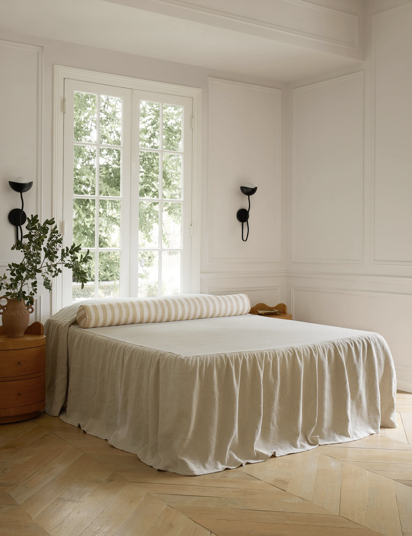
Draw a Clean Slate with Monastery Minimalism
If you’re tired of everything and craving a fresh start, invest in a simple, high-quality bedcover. Pull it over your two pillows and tuck it in around them so that your entire bed is one simple, beautiful surface. This also feels refreshing and casual for the upcoming warmer months, providing a sophisticated sense of serenity and ease.
Design: Sandra Weingort


I hope these ideas are inspiring! Here’s to throwing open those bedroom windows, letting in the fresh air, and enjoying a rejuvenated retreat!

SHOUT OUT LA Speaks to CALAFIA Home Design Founder Elizabeth Sims
In this exclusive interview, Elizabeth opens up about her remarkable journey, from the initial spark of passion to the thriving studio that exists today. She dives into her extensive background in art and how it drives her design work, and describes her father and grandfather’s small family business, and how it taught her the work ethic and respect for relationships that guides her business ethos. She also describes the origins of CALAFIA Home Design’s name, how it is connected to California, and why the golden state’s diversity echoes the beauty of her own family.
about art, design, family, and what inspires her most

When Shout Out LA recently reached out for a sit-down with our Founder and Principal Designer, she shared a story that is a testament to the power of determination and creativity.
In this exclusive interview, Elizabeth opens up about her remarkable journey, from the initial spark of passion to the thriving studio that exists today. She dives into her extensive background in art and how it drives her design work, and describes her father and grandfather’s small family business, and how it taught her the work ethic and respect for relationships that guides her business ethos. She also describes the origins of CALAFIA Home Design’s name, how it is connected to California, and why the golden state’s diversity echoes the beauty of her own family.
Elizabeth even outlines her ideal Bay Area weekend itinerary, providing a roadmap to all the local inspiration that keeps her creative practice rooted in this wonderful place. So, whether you’re looking for weekend ideas or insight into crafting an enterprise out of your own passions, read on here.
10 Artist-Inspired Ways to Make Your Home Look Custom
Looking to add character to your builder grade home? Discover 10 artist-inspired ways to make your home look custom, special, and uniquely your own.

My Aunt Jody Terrazas’ home in Spain, furnished with art and antiques, as well as ironwork by my uncle, Reynaldo Terrazas
The most beautiful homes I've been in are not the most expensive ones.
The interiors that made the biggest impression on me, that whispered rich stories about the people who lived in them and still live on in my memory, where the homes of creatives.
There was the tiny apartment of the married poets whose every (I mean every) surface was stacked with books. There was the curator's home with the disco ball in the shower. There was my Aunt and Uncle's Oakland home, with its golden walls, collections of Mexican pottery, and my uncle's ironwork everywhere—from the banister to the pot hooks.
These homes might have looked out of place on Pinterest, but in person they were welcoming, intriguing, and unforgettable.
Maybe your home is builder grade, a tract home, or a rental, and you want to add character. Maybe you find it difficult to parse the home decor trends for what reflects your personal taste. Maybe you simply long for a space that feels like you. As an artist that grew up around artists, I learned a creative attitude toward making a home that I carry through my work as a designer. And the good news is that, while artists seem instinctually to make a home feel special, they do so in ways anyone can borrow.
Here's ten creative approaches to your home that will make it feel unique, custom and special.

1.
Know What Inspires You
What moves you? I'm not talking about interior design trends, though you can include them. I'm talking about what gives your life joy and meaning.
Maybe it's family, or your ancestral origins. Maybe it's a particular place you spend summers, or a lifetime of world travels. Maybe it's food, or books, or marine biology. You can find inspiration anywhere—your favorite brands, your grandfather's house, a beloved cookbook. Whatever it is, add images to a collage or a Pinterest board. Yes, that's right—an old fashioned mood board.
When you're done, take a look: what colors, textures, and feelings emerge? If you can start to identify patterns, palettes, and themes, use these to guide your design choices.
photo: my 2023 mood board
2.
Frame it
An easy, budget-friendly way to inject your personality into your home is by framing the special momentos of your life, and I don't just mean photos.
Frame love letters, your grandmother's hand-written recipe, children's artwork, old concert tickets, or a wallpaper swatch from your childhood home. Frame architectural plans and family documents. Frame objects like military badges, old keys, and that feather you found on that special hike.
Use a professional framer if you can, even for humble objects, or source vintage frames at flea markets. Or just use these, which I love.
design: Studio Iro
3.
Create Unexpected Encounters
Now that you have a collection of framed art, mementos and objects, go beyond the gallery wall and be creative in your placement.
One of my favorite tricks is to hang art asymmetrically. Try a small piece above the left side of the headboard, or just off-center of the mantel. It looks special and considered.
And don't neglect the less obvious surfaces and areas of your home. I've seen art beautifully installed under a kitchen cabinet or even on the range hood. Try art in a larger closet, a small bathroom, in a bookshelf or over an interior door. The more unexpected the better.
Design: Hotel Lou Pinet

4.
Light the Mood
Think like a theater director and layer lighting fixtures to set a scene.
Diners linger over a table lit softly by a chandelier. A task light by a cozy chair invites a reader. Sconces flatter (where canned light can be harsh). Picture lights highlight special pieces. A little table lamp on a kitchen countertop is perfect for a midnight snack.
And don't forget candlelight! It makes a space feel cozy and belongs in every room.
design: Aker Interiors

5.
Include Vintage
When everything is new in a home, it tends to look dated quickly.
To give your home a timeless look, layer in a vintage area rug from the flea market, midcentury chairs from Facebook Marketplace, and lamps from local antique shops. That old armoire of your great-grandmother's is probably pretty special too.

6.
Customize Upholstery
This tip isn’t the most budget friendly of the bunch, but is generally a sound investment, especially considering the declining quality and comfort of retail upholstery today.
Many designers know incredible vendors of custom-made-in-the-USA furniture and are happy to help you place even a single order. Source your fabric (upholstery grade) by taking a trip to your local design center or fashion district, or source vintage fabrics online.
You can also ask a local tailor to turn your fabric finds into throw pillows or cushions (this is an easy diy for anyone with a sewing machine). A single lumbar bed pillow made from a vintage rug found on your travels could elevate the whole room.
design: chrislovesjulia

7.
The Magic is in the Details
Artists notice details. And a whole room can be transformed by a single one.
Hit the salvage yard to replace all your builder grade doorknobs with beautiful old hardware. Upgrade your light switches from plastic to brass or ceramic. Update your molding. Choose paint color carefully—even if the wall color is white, make sure it’s the most beautiful white. Consider booking a color consultation with a designer.
Nothing is so humble that it can't be beautiful. Get a pretty wastebasket, an elegant pen holder, a special soap dispenser.
design: Ashe Leandro
8.
Treat Your Windows
Windows connect you to the world, frame your view, and modulate light.
Find beautiful solutions for them.
If you can't afford custom drapery, look for affordable roman shades or bamboo blinds, or take some pretty fabric to the tailor to make into cafe curtains.
Window treatments are a great place to get creative.
design: Betsy Brown Inc.

9.
Commission Craftspeople
When considering a furniture purchase or built-in, consider whether you could commission a custom-maker instead of buying retail.
Artists' homes are full of things their friends made, but you can email the director of a local art school, search Etsy, or tour open studios events to find the right artisan for your project.
Be honest about your budget and open about your desires—a craftsperson will be happy to guide you through costs and design ideas. You'll be supporting your local creative economy and in possession of an heirloom.
design: Commune Design

10.
Bring Nature In
Artists find inspiration outside.
The next time you find an interesting chunk of driftwood, consider how it might look above your mantel. Put your shell collection in a beautiful bowl on a side table for visitors to sift through. Print a shot of your favorite landscape and frame it. These living elements connect the home to the world beyond, and speak to the curiosity and adventures of its owner.
design: Lauren Leiss
I hope you discover some inspiration in these ideas—there are many easy ways to make your home look unique, feel special, and reflect your personal style that don't involve renovating, remodeling, or investing in expensive millwork or custom built-ins. These projects can help anyone dream beyond the cookie cutter and think like an artist or an interior designer to create a space you're proud of.
And let us know in the comments which homes you've never been able to forget, or which special detail makes your home feel custom. Thanks for sharing!

A 2024 Post-Covid Renovation + Redecorating Guide: What to Know Now
As you probably know, the Covid-19 pandemic changed the home renovation and decor industry forever. So, where are we now? Is it a good time to take on a project? What can clients expect?
if you’ve been asking yourself any of these questions, read on.
(…With some design inspiration to keep things interesting… )

design: 1000xbetter | photo: michael p.h. clifford
As you probably know, the Covid-19 pandemic changed the home renovation and decor industry forever. People stuck at home had the extra money and motivation to pull the trigger on projects, creating an industry boom that led to product innovation and slew of new talent, but also shortages in materials, professionals, and staff that drove up prices and timelines.
So, where are we now? Is it a good time to take on a project? What can clients expect?
If you’ve been asking yourself any of these questions, read on. I’m here to walk you through the industry landscape at this moment, as well as give a little guidance to planning for your dream project.

1.
The Financials
Let’s just get the tough news out of the way—for the most part, those post-pandemic price tags aren’t going anywhere. Inflation, continued shortages of staffing and materials, and the affect of political unrest on shipping all make it difficult for vendors to bring down prices.
That being said, there are areas where prices are expected to recalibrate, such as in lumber and steel. And since most costs aren’t expected to fall any time soon, if ever, there’s no reason to either jump before you’re ready, or wait for a projected shift. My best advice is to know what you’re comfortable spending and what your priorities are, and get a trusted professional on board to help you make the most of your investment.
Ok, we got the bad news out of the way! Read on for some encouragement…
Design: Handlesmann + Kahw
Photo: Felix Forest

2.
Project Timelines
For a while there, it seemed impossible to get on a contractor or designer’s calendar. The good news is that while demand has remained high enough to keep quality professionals in business, there is much more availability.
And here’s the silver lining to the financial outlook—contractors and designers who have been able to stabilize staffing but also have space on their calendar can work efficiently, and efficient projects ultimately cost less.
Design: Love is Enough
Photo: Chris Mottalini

3.
Lead Times
Which brings us to our next sign of progress—lead times!
During the pandemic it wasn’t unusual for a custom chair to be estimated at 36 weeks out. Now, not only are most lead times reduced to the usual 4-8 weeks, but many vendors have introduced more ‘quick ship’ and ‘in-stock’ lines to meet customer needs.
This gives designers a lot more resources in meeting project needs, reduces receiver/warehouse fees, and leads to efficient projects that, yes, cost less!
Design: Ashe Leandro

4.
Product Quality
There’s been a huge shakeup in product quality, and as a professional watching it happen in real time, I feel for consumers trying to navigate sourcing and purchasing out there on their own!
Happily, I’ve seen less (not zero) product damages as supply chains begin to stabilize. Unfortunately, I’ve also seen vendors shutter overnight due to unstable private equity backing or mismanagement of the pandemic boon. And finally, I’ve seen large companies put out lower quality product, surprising customers who may have gotten a better quality product years ago. Corporate buy-outs, factory changes, and the cost of materials are just some of the reasons this is happening. The best way to locate quality is to become educated on the materials and techniques that result in furnishings worth their investment, or to work with a professional who knows the field and can get you the best bang for your buck.
Design: Heidi Caillier

5.
Return on Investment
I’m glad to report that when it comes to ROI, the industry has remained strong. Renovations projects can expect a 60-110% return on investment, nation-wide. Kitchens and baths are still the gold standard on short-term investment for homeowners who are anticipating selling in the next decade. For long-term returns, finished basements and ad-ons are a strong bet.
Furnishings projects, of course, don’t add financial value except to the degree that they can prevent staging costs, but a home is more than a financial investment. The value of a beautiful, comfortable, and well-organized space is in it’s enhancement of mental health and family connectivity.
Design: Scribe Studio
Photo: Haris Kenjar
So what’s the final word?
Prices are high, but they’re also probably not budging, and the industry is continuing to stabilize, with lots of talent available. A well-considered investment is almost sure to be a smart one.
I would advise those considering a project to sit down with a professional or two and talk though their dreams, their priorities, and their budget. There’s no reason not to start a project right now if you have the means to achieve your desired goals, and a pro can help you determine whether now is the time.
I hope this little guide has been helpful! If you have more questions, please let us know—send an email or leave a comment! We’re here to help and would love to keep the conversation going.

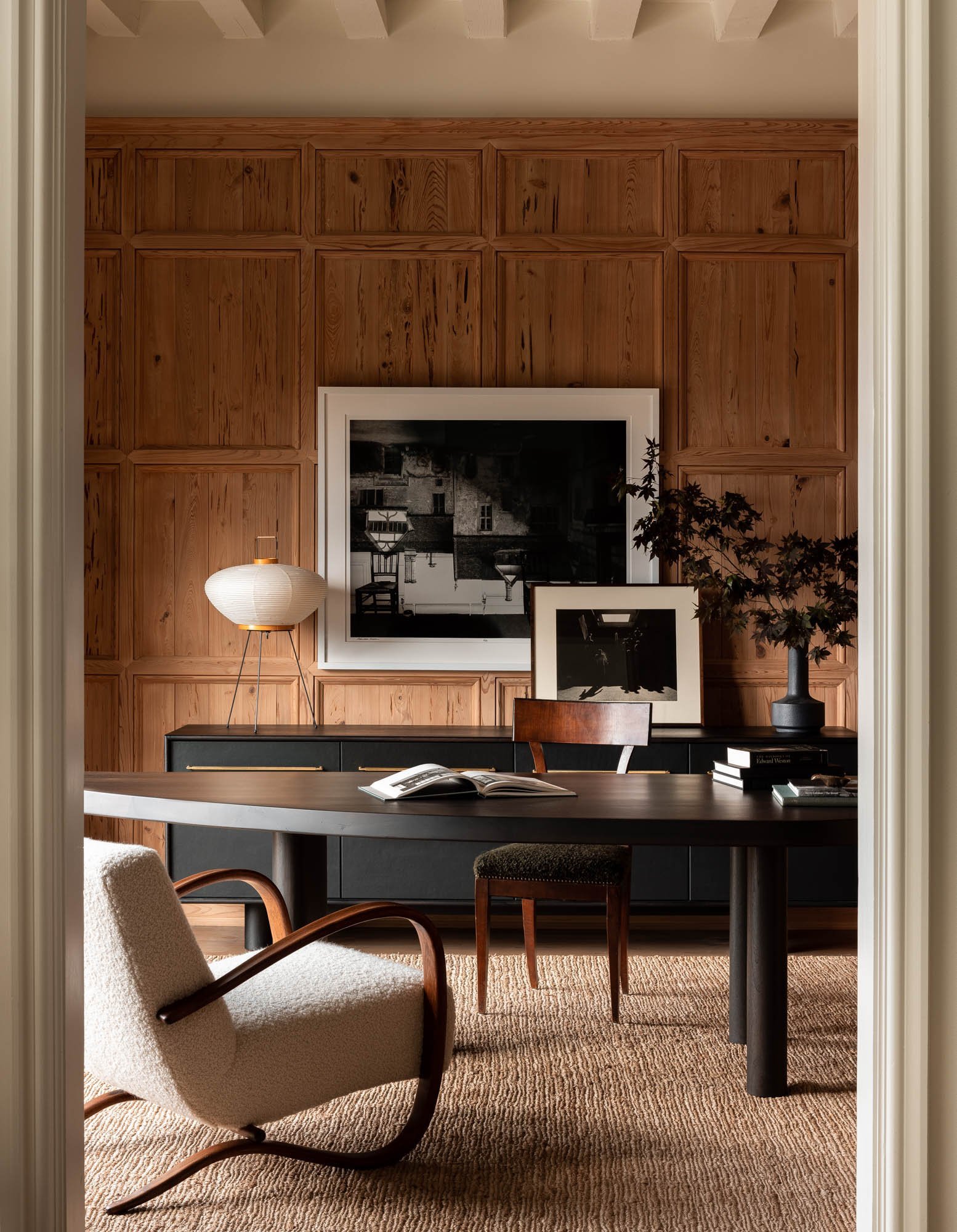
Five Design Elements I’m Excited to See Trending for 2024…and my Philosophy on Trends
It’s time for a look forward—and a 2024 design trends update! But first, a little on my philosophy towards trends . . .
It’s time for a look forward—and a 2024 design trends update! But first, a little on my philosophy towards trends.
All design elements run in and out of the trend cycle. When trends emerge, it usually signals that someone has reinterpreted an element that’s been out of the limelight for a while in a creative way. It feels fresh, exciting, and it inspires others. This is a good thing! Trends only become stale when they are chased by the market which oversaturates the media environment with watered-down facsimiles. So, to create timeless designs, approach trends with these three things in mind:
Novelty is exciting! Make sure you are attracted to a trend in an authentic way by understanding whether it resonates with a deeper memory or value. If a trending item reminds you of your childhood home or something you like to wear, for example, then you probably connect with it authentically.
Interpret instead of copying. Use the trend to evoke the values, memories, or aesthetics you already have. Give it your own twist.
Seek balance. A design plan that is entirely on-trend will eventually look dated. Only integrate trends that speak to you, and layer them with less popular elements.
Now for a sample of some of the trending design elements that give me that spark of recognition—things I’ve always loved but am now seeing afresh.

1.
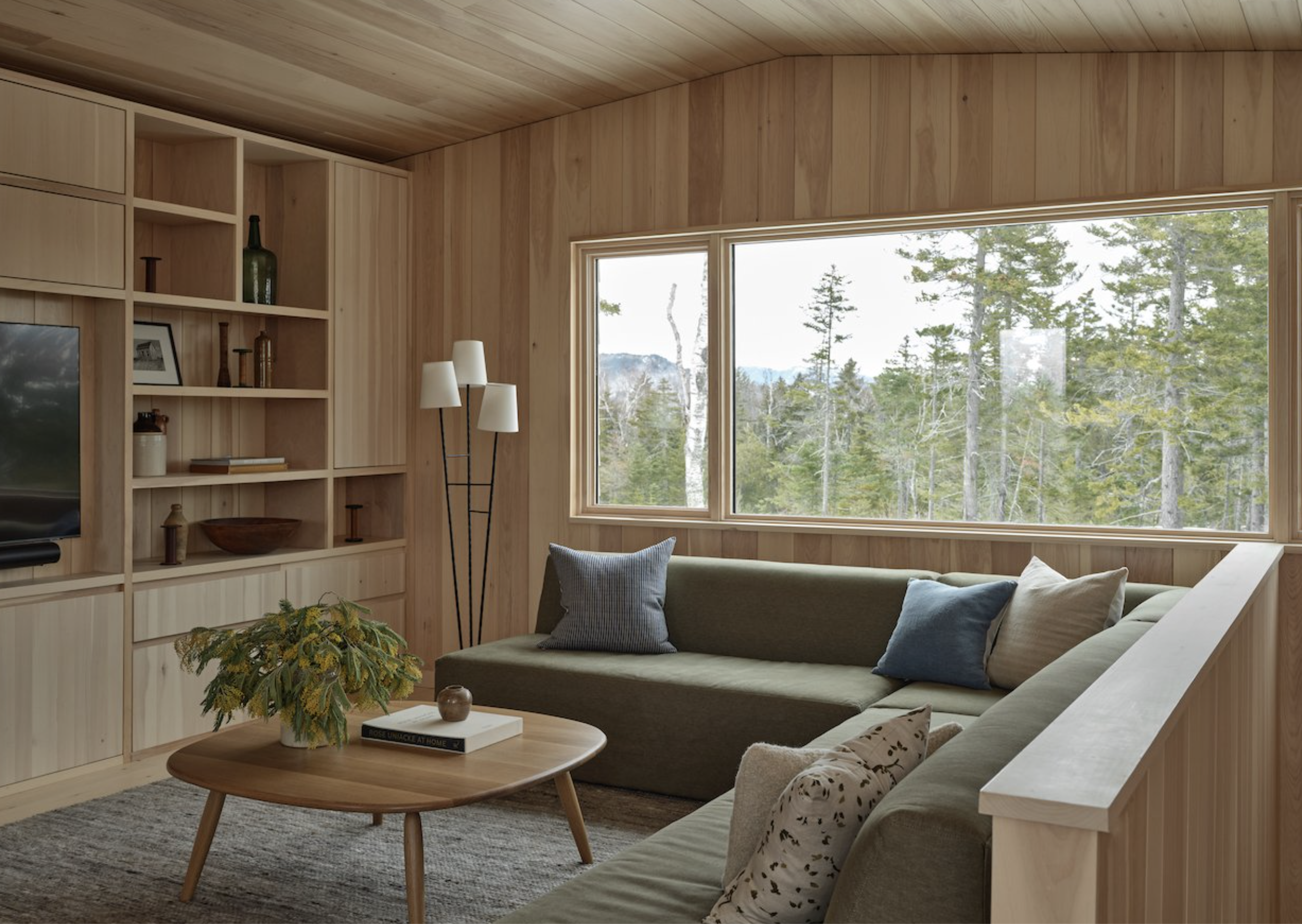
Wood Everywhere
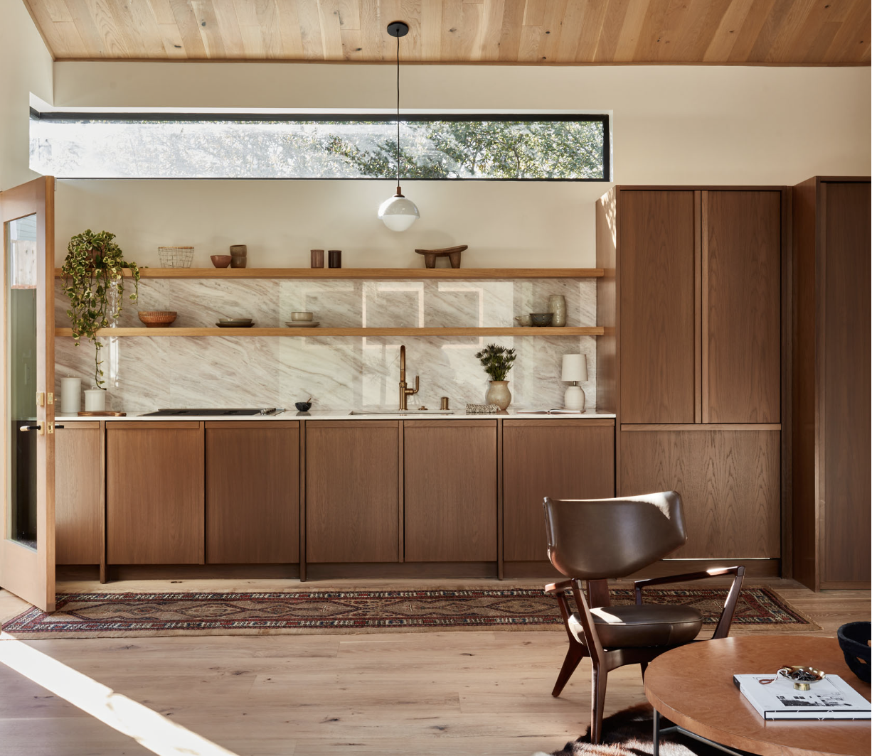
Warmth and coziness are prized in post-pandemic design, and the remote-work movement has inspired primary homes that look like weekend cabins and cottages.
Since there’s nothing warmer or more nostalgic than wood, we’re seeing it in detailed panelling, specialty millwork, and more. I particularly love a wooden countertop or cabinetry detail that replaces hardware. I’m inspired to channel Sea Ranch, teak houseboats and cedar saunas as I look to this wondrous material for ways to make a home a retreat.
Design: Grotto Studio

2.
Deep Reds
Burgundy. Maroon. Mulberry. Claret.
Moody interiors are taking a new trajectory, from pensive to passionate. Warmth being the overarching trend of design currently, its natural apex lies in the color red. But red has range; chocolatey brown-reds imbue down-to-earth luxury, while berry hues add a bright acidity.
When I was a little girl, my favorite color was red. I guess pink just wasn’t strong enough. Though earth-tones are really my thing, I’ve always had a red accent piece or two in my wardrobe. The color that’s speaking to me now is oxblood, and it’s asking me to lean-in to my girlhood passions and be bold.
Design: Bed Threads

3.
Hand-Painted Details
The recent trend of color-drenching (painting all surfaces in a room one color), is an ingenious way to modernize a traditional space, and I still love to use it to quiet a space or disguise certain features. But what to do when you want to enliven a space or play up its charms?
Murals, stenciled beams, and high contrast color schemes have made a cool, quirky entrance lately, treating the home as a canvas for personal expression. As an artist, nothing could make me more excited.

4.
Ultra-Custom Cabinetry
I’ll always love a Shaker cabinet, and laud the accessibility of such classics, but their ubiquity has created a hunger for the idiosyncratic. Whimsical cut-outs, repurposed vintage, and woodworking details that replace hardware are popping up everywhere, taking the notion of custom to another level.
Design: Becky Carter

5.
Silver Accents
While I’ll nurture a fetish for unlacquered brass until the end, it’s really lovely to see finishes in hues of sterling, pewter, gunmetal and chrome emerge as a foil to all that prevailing warmth. We’re seeing them largely in accessories, which I love to see mixed in with brass and bronze.
These accents remind me of the jewelry collections of the women in my family, culled from the southwest and Mexico, in moonlit hues and totemic shapes. I’m inspired to work with silver as a means of adding a little mystery to my design plans.
Hardware: Mi & Gei


The last decade of design has grounded us in classic forms, serene neutrals, and natural materials. Looking over these trends, I see an overall shift toward emotion, expression, and creativity, but I think it can all be balanced and integrated with that classic foundation, enhancing it rather than replacing it. The future looks full of intuitive, imaginative design, and I couldn’t be more excited to take part in it.
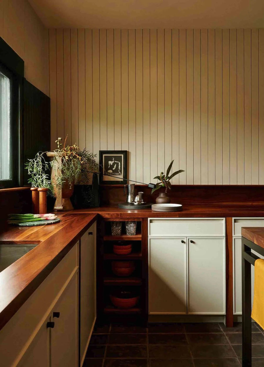
My Favorite Kitchen Finish Combination for Warm, Earthy Kitchens
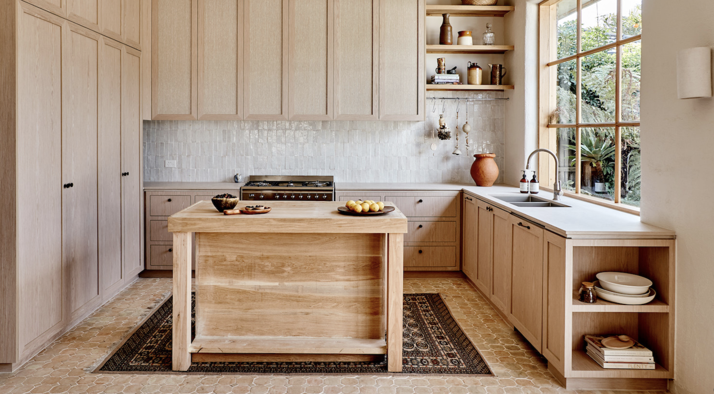
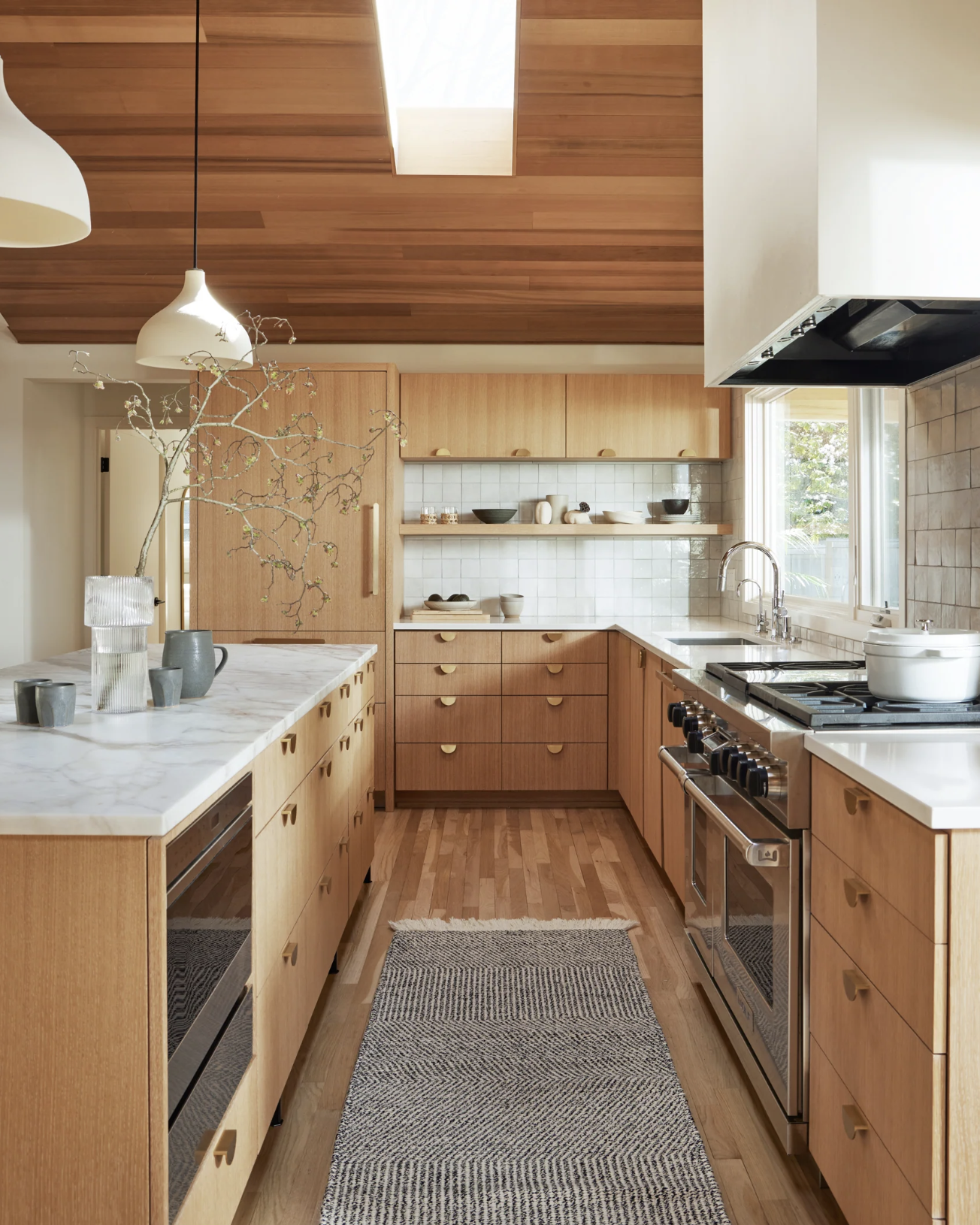
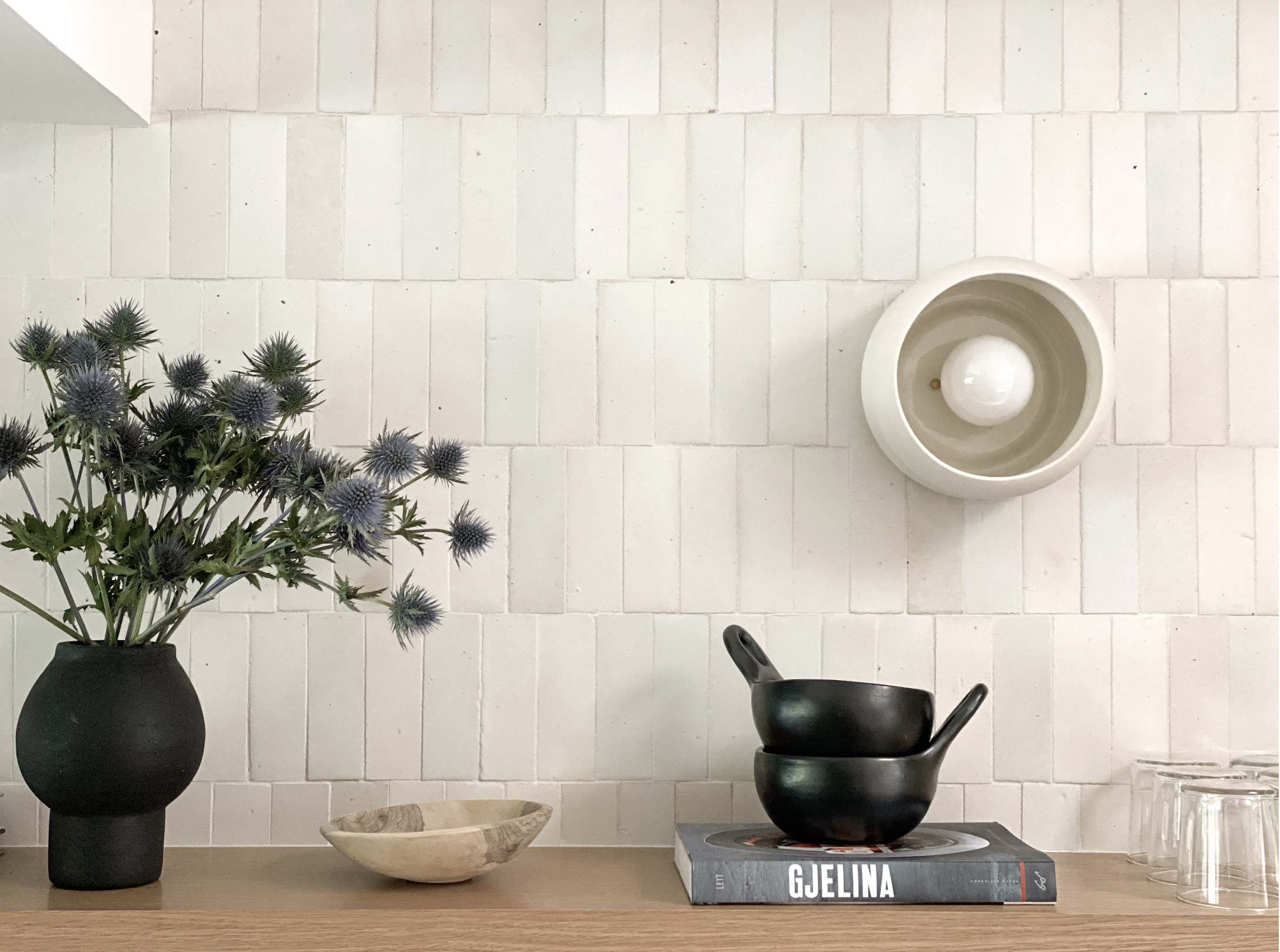
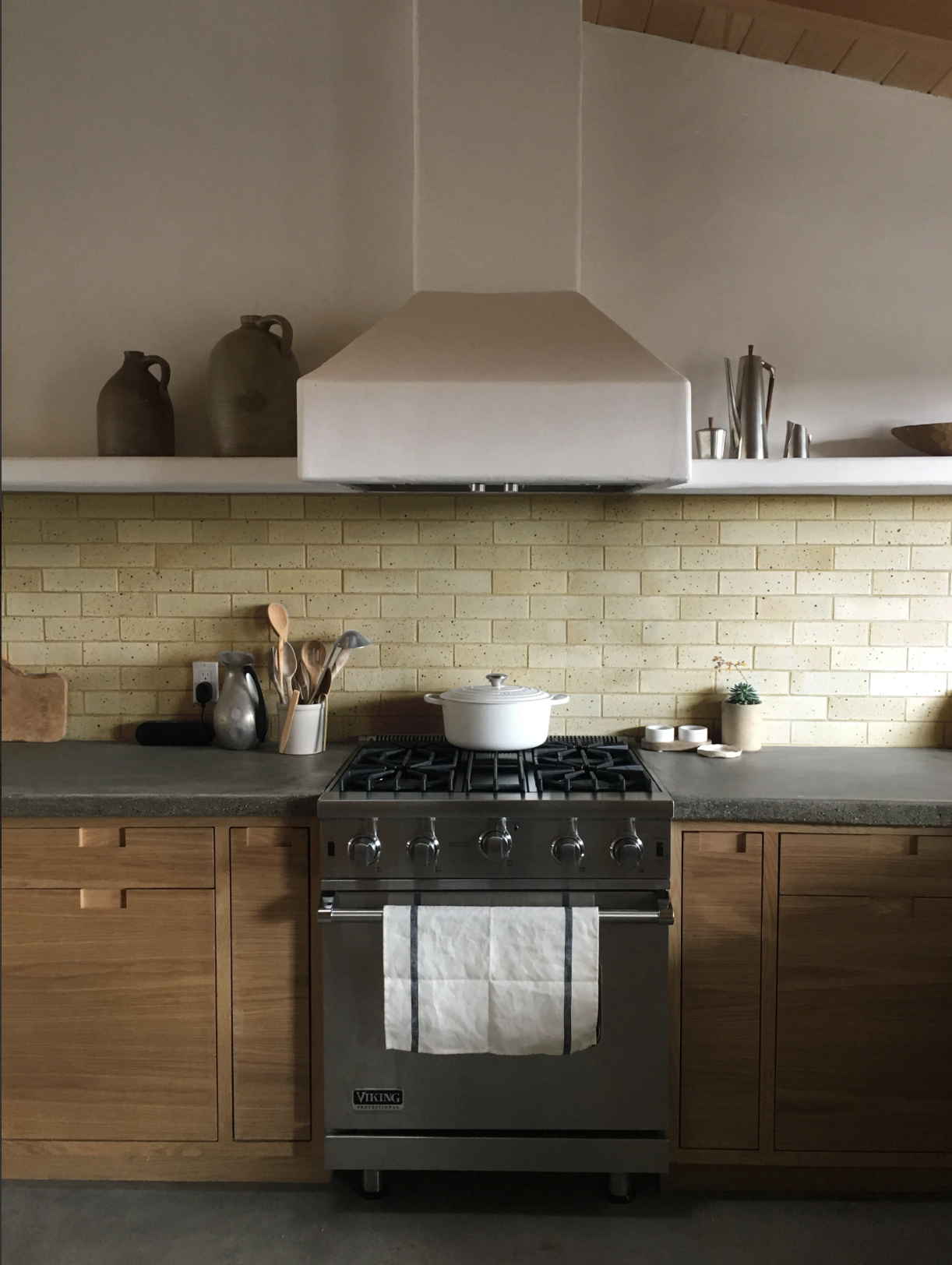
Every time I’ve seen a particular kitchen finish combo lately, I’ve had to stop in my tracks and study it. I’m talking about wood-finish cabinetry paired with rustic tile. This combination is breathing new life into kitchen design, an area beset with trends and formulas.
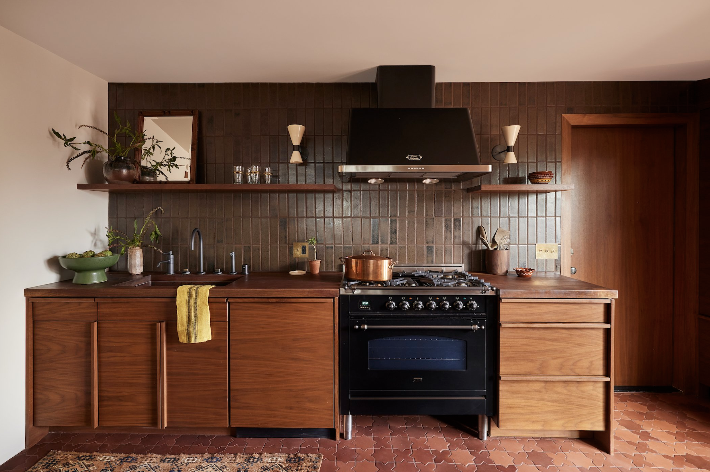
Every time I’ve seen a particular kitchen finish combo lately, I’ve had to stop in my tracks and study it. I’m talking about wood-finish cabinetry paired with rustic tile. This combination is breathing new life into kitchen design, an area beset with trends and formulas.
The wood cabinetry transcends popular colors, and offers so many opportunities for customization. It can also be hardier and more durable, hiding fingerprints and resisting chipping.
Rustic tile includes zellige, brick, and anything with color or textural variation. I look for tile with iron spots, uneven glazes that reveal the ceramic color beneath, and color shifts. You can also always mix two or three close colors into one batch for something really unique.
Read on for inspiration and a glimpse of the many moods and effects possible within this combination of finishes.

1.
Soft Color
I love neutrals because they are so full of color. This isn’t a position everyone takes—understandable! It may come from years of obsessing over mixing just the right grays and browns in my watercolor palette, but I see so much color in neutrals, and I love the gentle way they invite the eye to linger and discern.
This kitchen is great illustration of what I mean. When paired together, simple white oak cabinetry and off-white tile provide a rich contrast of warm and cool tones; a spectrum of warm, peachy hues, and iridescent green-grays.

2.
Dark Roast
We’ve heard so much about dark and moody interiors (love them, by the way), but what about dark and joyful ones?
This combo of walnut cabinetry, bronze hardware, and rustic olive tile reminds me of chocolate, coffee, and banana bread. It reminds me of the relief of coming into a cool, dark room after too much time in the sun.
I love the commitment to dark-hued materials in this room, as well as the choice to carry the tile from the wall to the floor, creating simplicity and continuity.
3.
Natural Geometry
Rustic tile and natural wood don’t have to lean wabi-sabi (a japanese aesthetic celebrating the beauty of imperfection.) This kitchen illustrates that these materials can achieve clean, modern lines too. Especially when you emphasize geometric shapes in the hardware and tile, and select a wood varietal with a straight grain.

4.
Variation + Texture
There is so much movement and interest in this kitchen. I am struck right away at the variation in hue in the green tile—each piece looks hand-made and carefully selected for a one-of-a-kind installation. The strong wood grain pattern in the cabinets provides the perfect balance.
5.
Focus on Materials
For me, minimalism is really about allowing one’s attention focus on the special and particular qualities of something. Paired with a neutral white oak countertop, the the color variation in these quiet white tiles comes to life. The placement of another ceramic piece, the modern sconce, right upon them, emphasizes the material’s beauty.
6.
No Hardware
One way to really emphasize the beauty of natural wood finish cabinetry is to forgo hardware and build pulls directly into its form. This custom look draws attention to craftsmanship and celebrate’s the material’s down-to-earth beauty.

7.
Cabinetry as Furniture
Conversely, wood cabinetry can acquire the upscale look of fine furniture when fitted with hardware as special as this. The rustic zellige tile gives this pairing a timeless, old-world feel that will never look dated.

8.
Perfectly Imperfect
Kitchens are spaces for creativity, gathering, and experimentation. For this reason, I love a wabi sabi kitchen that embraces a bit of wobbliness, accumulates patina, and feels connected to nature and its materials. Wood cabinetry, with all its knots and grain, when combined with rustic tile, is a classic combination that easily achieves this handcrafted, natural, homey feel.
Here’s one more showstopper that has it all; custom wood cabinetry with very special details in contrasting varieties, offset with the glimmer and ethereal color of white zellige tile.
Thanks so much for reading! I hope you’ve gathered some inspiration for your dream kitchen!

5 Inspired Ways to Update a Mid-Century Home
What makes a mid-century home special? If it’s an Eichler or a Stahl the answer may be obvious—rigorous geometry, expansive windows, a sleek roof line, and an open floor plan inviting casual, modern living. Sometimes, without the right touch, homes built during this era can feel simply boxy or lack personality. Fortunately, it doesn’t take much to restore the creative spirit of the early modern age to any mid-century home. Using our Mid-Century Organic project in Walnut Creek as a test case, we’re sharing five ways you can help your home’s heritage shine, while refreshing it for the current day.

What makes a mid-century home special? If it’s an Eichler or a Stahl the answer may be obvious—rigorous geometry, expansive windows, a sleek roof line, and an open floor plan inviting casual, modern living. Mid-century architecture was the result of a boom in technology, design and cultural optimism following the end of the last World War—designed to strip away stuffiness, let the outdoors in, and host a new age of ease and prosperity.
Sometimes, without the right touch, homes built during this era can feel simply boxy or lack personality. Fortunately, it doesn’t take much to restore the creative spirit of the early modern age to any mid-century home. Using our Mid-Century Organic project in Walnut Creek as a test case, we’re sharing five ways you can help your home’s heritage shine, while refreshing it for the current day.
1.
Go Trimless
The modern bones of our clients’ Walnut Creek home were obvious in the large windows that wrapped the house, each topped with a clerestory window that emphasized the long, low roof line. Originally, they were trimmed in a simple 5” shaker trim (before and after photos below!)
By removing this trim, and even selecting a trimless baseboard style during the renovation, we streamlined the architecture, opening up the space, emphasizing the views, and adding a thoughtful detail the elevated the entire design.

2.
Tile the Kitchen Floor
This one makes all the difference—instead of a traditional wood floor, select a geometric tile, and don’t be afraid to let it be the centerpiece!

3.
… And the Fireplace!
Tile was an essential mid-century finish because it was mass-produced, available to all, and allowed for maximum creativity. Heritage brands like Heath still exist today.
Upgrading a fireplace with tile adds a sleek design focal point to your living space and can be a prime place for creativity in even a minimal space.
4.
Refresh the Palette
While the mid-century palette embraced primary colors in addition to its classic modern whites, you’re welcome to update the look with earthy neutrals like we did here. Not only do these tones feel current, but they bring in the beauty of the surrounding landscape, embracing the indoor/outdoor lifestyle of mid-century design.
5.
Add Warmth with Natural Materials
Though cutting-edge for their time, mid-century homes were also designed to be down-to-earth. Their modest profiles hugged the landscape, and their forms were often inspired by nature itself.
In this project, we warmed up the white walls and clean geometry of the windows and tile with lots of warm wood textures. Jute rugs, walnut doors, oak floors, and wood-and-woven seating add to the mix.
And there they are—our five favorite ways to bring out the soul of a midcentury home. Want to see the impact of these changes? Check out the before and after images below!
The kitchen before…a country feel in a modern shell.

The living room before…a chunky stone fireplace and bulky trim.
…and after! Light, bright and modern.

…and after! Refreshed and streamlined.

Inspiration | A Trip to Ireland
This summer we attended a family reunion in my parter’s family’s home town of Belmullet, Ireland. There, the aunts smothered us in enormous breakfasts (turns out black pudding is harmless!) and the uncles charmed us with that iconic dark humor. The air in this seaside town smelled always of peat smoke, and it seemed as though everyone owned at least a handful of sheep.
Here’s a glimpse of what captured that balance between the bleak romance of the rocky isle, and the cheer and comfort sheltered within.

This summer we attended a family reunion in my parter’s family’s home town of Belmullet, Ireland. There, the aunts plied us with enormous breakfasts (turns out black pudding is harmless!) and the uncles charmed us with that iconic dark humor. The air in this seaside town smelled always of peat smoke, and it seemed as though everyone owned at least a handful of sheep.

The full Irish.

Aunt Anne’s spotless home on the coast of County Mayo.
After the festivities, we headed out on our own adventures, which centered on animals to please our little one, but ended up delighting us all. First, we headed to Ashford Castle, which had me swooning around its gardens pretending to be a Great Lady. There, we wandered the wooded grounds with our own personal falconry expert, sending our bird into the trees to follow from limb to limb until we called him back to the glove with a whistle.

Our Harris Hawk and host, Stoker.

Ashford Castle, looking out to the lake and its islands.

Just one secret path in its meandering gardens.
Then we went for a country ride near the Cliffs of Moher on three beautiful Gypsy Vanners at the Mountain View Horse Riding Centre, and attended a sheepdog demonstration at the Caherconnell Fort, which had us rapt at the smarts of five adorable border collies.


Throughout Ireland, I was struck by the balance of brightness and darkness—the bluebird skies that suddenly turned dark with summer gales, the light-hearted delivery of black humor that reminded me of great Irish literature, and the contrast of elements in the architecture we saw everywhere. Here’s a glimpse of what captured that balance between the bleak romance of the rocky isle, and the cheer and comfort sheltered within.
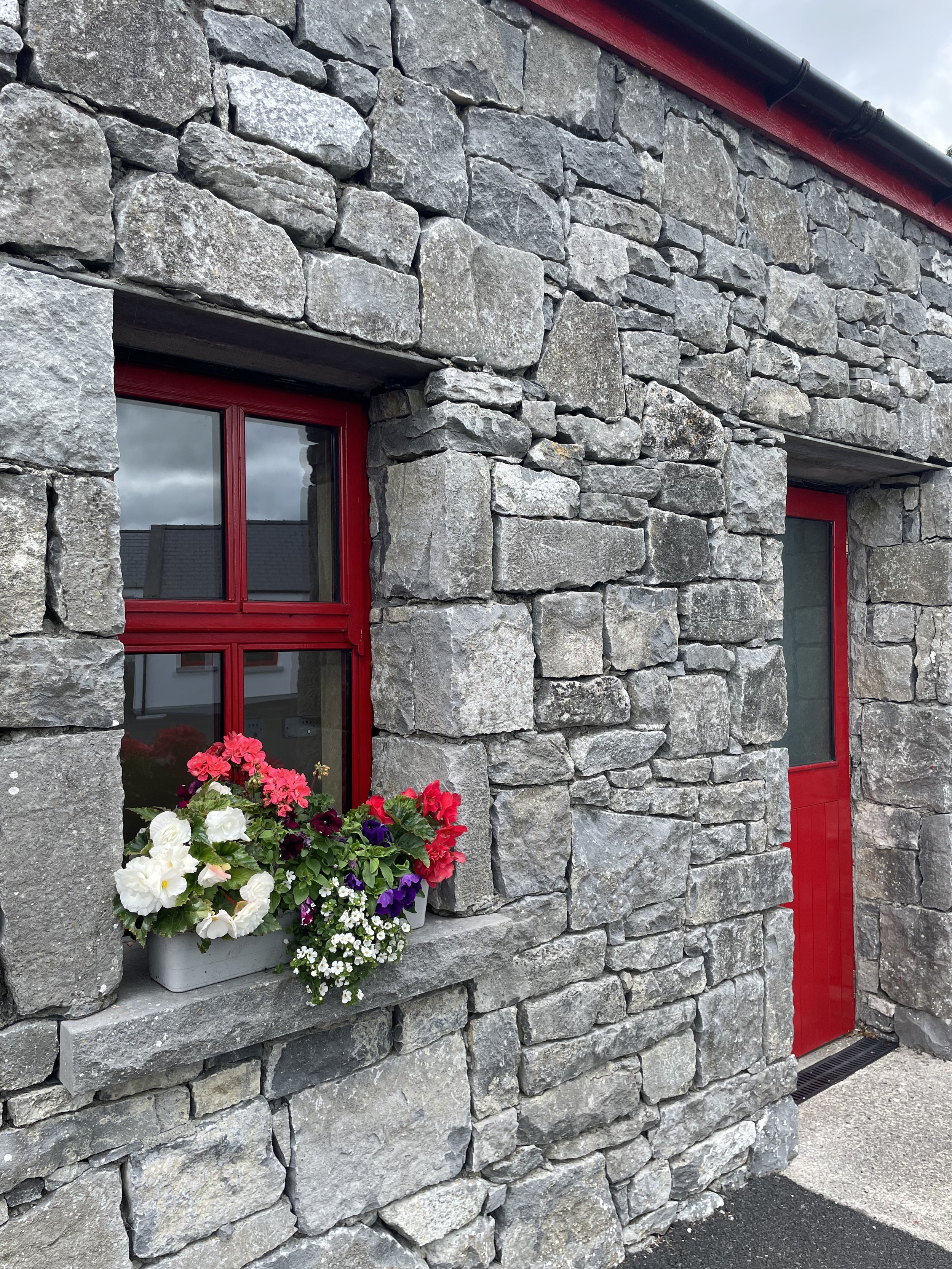
The Beauty of Stone

Ashford Castle on Lough Carrib.
Stone is an art in Ireland. I couldn’t get enough of the hand-built stone walls that criss-cross the countryside, so delicately made of such rough material, with creative flourishes here and there. I loved the centuries-old chisel marks, the lacy lichen blooms, and the occasional hank of sheep’s wool caught on their craggy surfaces.


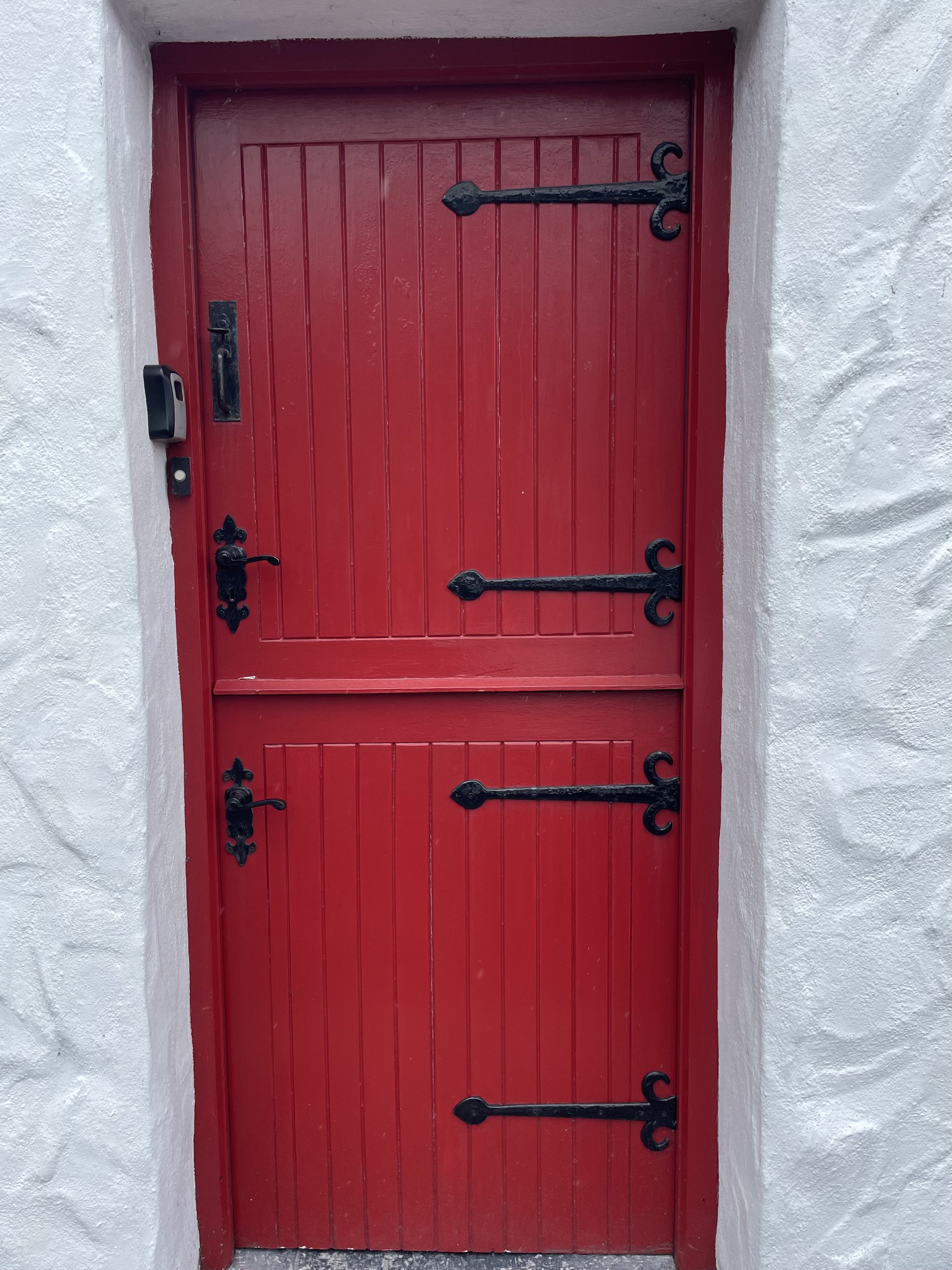
2. Cheery Red Accents

The austerity of stone is enlivened frequently with bright red trim, doors, and flower boxes. What seems like an aesthetic gesture has deeper roots, however—when Queen Victoria decreed that the Irish paint their cottage doors black, they rebelled by painting them red, a color that had long signified the hand of a great warrior.


3. White Wash & Thatch

The stone masonry was also often brightened with whitewash, which produces a lovely glow due to its calcite crystals. Historically, limewash was a resort of impoverished families who could not afford paint, but it bonded well with stone and has antibacterial qualities. Today, of course, limewash is very popular in interior design, providing an elevated rustic finish.


Another classic of Irish cottages, thatched roofs are an heirloom craft (like the masonry walls) that provides durability and beauty. Thatched roofing can last up to 40 years with minimal maintenance.
An Ireland-inspired Mood Board
So here’s what I’m dreaming of now—some imported Irish charm and coziness via rustic wool textiles, industrial fixtures, slate pavers, limewash and bold red accents (plus a bit of emerald!)

Finally, I wouldn’t leave you without some recommendations! Check out the links below for what got me excited and what really made my trip:
My favorite album.
My favorite page-turning non-fiction.
My favorite pub.
My favorite town.
My favorite park.
My favorite shop.
Thank you so much for reading! Sláinte!
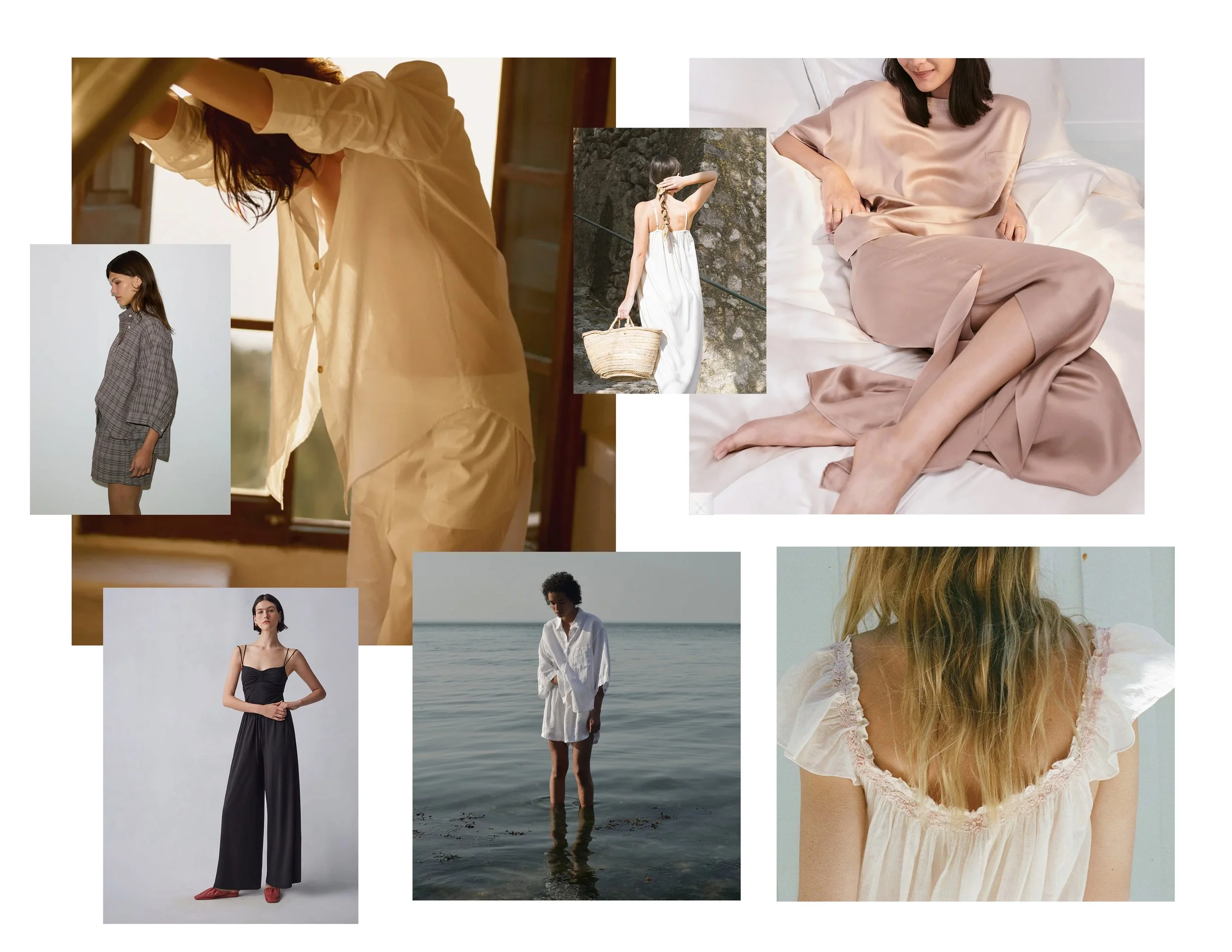
Inspiration | Summer Sleepwear So Pretty You Can Wear it All Day
It’s hot and I’m dreaming of diaphanous clothing that I can just drift through the day in. Sets and dresses I don’t have to think about. Things that reflect the dreamy time of year when we value elements that are relaxed, simple, just a bit undone.
Luckily, with many working from home, and a new emphasis on comfort in fashion, I’ve been seeing so many beautiful brands offer clothing that walks the line between loungewear and daywear. I’m inspired to experiment a little along this boundary, and here are a few of the pieces that seem full of possibilities.

It’s hot and I’m dreaming of diaphanous clothing that I can just drift through the day in. Sets and dresses I don’t have to think about. Things that reflect the dreamy time of year when we value elements that are relaxed, simple, just a bit undone.
Luckily, with many working from home, and a new emphasis on comfort in fashion, we’ve seen so many beautiful brands offer clothing that walks the line between loungewear and daywear. If, like me, you’re inspired to experiment a little along this boundary, here are a few pieces that seem full of possibilities.

1.
the Grampa Check Set
By Deiji Studios
Wear the shorts over your black maillot to the pool. Throw the top over jeans. Or roll out of bed, pair your best slides with the set, and call it a day. It’s a thousand outfits in one and it’s in my cart.
2.
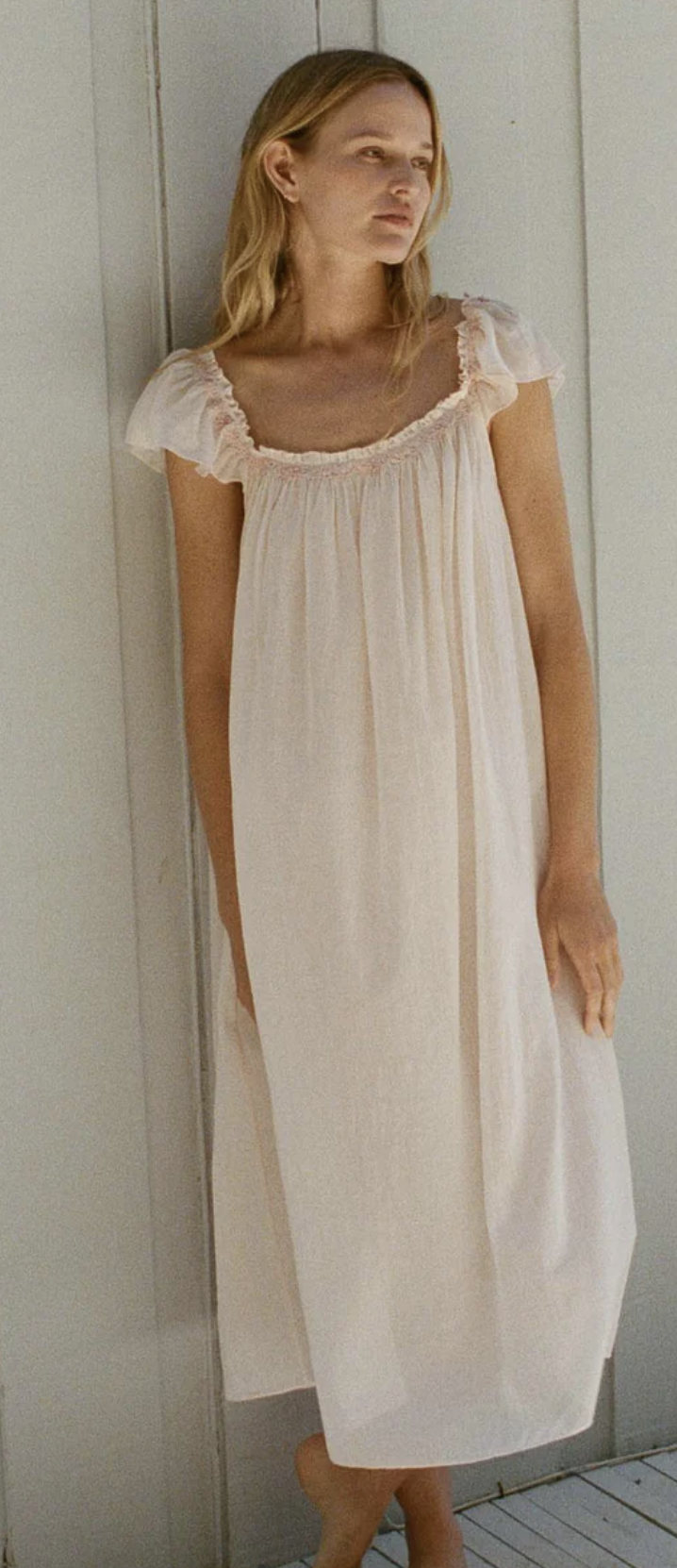
The Orelle Nightgown
By Dôen
Sleep like a princess. Then throw on ballet flats, tie a denim jacket around your waist and head out to brunch.

3.
the Organic Tencel Set
by Mate the Label
I have several sets from Mate because they are just so soft. I wore this one to sleep-away camp with my family this summer, and when the bells rang from the dining hall for breakfast, I just slipped out of my sleeping bag, threw on a denim shirt, baseball cap, and Birkenstocks and no one was the wiser because dang, I looked cute.

4.
the Washable Silk Set
by Lunya
I’ve been saving up for this one since my girlfriend wore it to a ladies weekend in Bolinas. She looked like a Hollywood starlet from the golden age, only cool and modern. With the right jewelry, this goes to a dinner party.

5.
the Washable Silk Set
by Quince
Washable silk on a budget that creates perfect separates. That silk tee will be gorgeous with trousers for work. Or just save them for evenings as a reward for a workday done.

6.
the Anjuli Nap Dress
by Hill House
It’s a nap dress. You’re basically required to take a nap. Wake up refreshed (and dressed) just in time for cocktail hour on the veranda. You don’t have a veranda? Let’s fix that.

7.
the Wide Leg Pima Set
by Cuyana
You’re wearing this to our first client meeting. We’re designing your new organic-modern kitchen.

I’m wearing this to our first client meeting under a blazer. We’re designing a custom dining set for your home with an artisan woodworker.

9.
the Marta Dress
by Ozma
This is a dress, but when you’re in Mallorca you wear it to dinner, to the beach, to the market, and to bed. You’re one of those women who looks great living out of a carry-on and always has room in her suitcase to bring home vintage ceramics from flea markets.

10.
the Zurich Linen Set
by Asceno
Color-drenched happiness. The top is basically a summer jacket. The shorts will look amazing with all of your button-ups. Just add sunglasses and sandals.
Thanks for reading! Here’s hoping you get lots of R & R this summer, and time to enjoy the warm summer nights. Don’t forget to sign up for our newsletter for more reverie.

Our Top Five Favorite White Paint Colors for 2024, Designer-Tested-and-Approved
There’s no easier transformation for a home than paint, and yet for the uninitiated, there is nearly no harder task than selecting a paint color! Especially when it comes to whites. So here’s a list of some of my absolute favorites . . .

The dining room of our Mid-Mid Organic project, painted in Benjamin Moore’s Simply White.
There’s no easier transformation for a home than paint, and yet for the uninitiated, there is almost no harder task than selecting a paint color! Especially when it comes to white paint. White is one of the hardest paint colors to get right because its effects are so subtle. So, if you are looking for the best white paint colors, whether for walls, cabinets, or trim, read on for my go-to whites—a list of some of my absolute favorites—and if you’re still not sure, don’t forget we provide Color Consultations, a quick and easy way to get a professional palette designed for your home.

1.
White Dove by Benjamin Moore
Benjamin Moore White Dove OC-17
White Dove is one of my favorites because it's such a soft shade of white (with just a feathery touch of grey). It's the right white for walls and ceilings when I want a white that feels fresh but not too modern—it pairs well with a transitional style home, or an eclectic mix of contemporary and vintage furnishings. It's such a popular paint color because it's a true neutral, a soft white that's not too stark or too creamy.
Seen here on our Coastal Eclectic in Sausalito project.

2.
Cloud White by Benjamin Moore
Benjamin Moore Cloud White 0C-130
Cloud White is my new favorite white. It feels like a pure white lit by sunshine into a subtle glowing warmth. It is bright without feeling cool or stark, and warm without feeling yellow or creamy.
It pairs miraculously well with tricky warm or deep wood stains in trim or flooring, elevating rooms that might feel a bit dated into luminous spaces that can handle modern furnishings. If you want to create a bright white space in an old dark home, this is the perfect white for you.
Seen here in our Modern Drama project in the Oakland Hills.

3.
Swiss Coffee by Benjamin Moore
Benjamin Moore Swiss Coffee OC-45
The classic! The reason Swiss Coffee is that universal paint, everyone's go-to? This warm white is just so versatile. A white with just the right hint of earthiness, it’s great in Spanish or Craftsman homes that want to retain their historic character. A subtle cream white, it works well on all surfaces, including exteriors. If you want to create a white space that is warm, this white may be the perfect wall color for you.
Seen here on a Rockridge home for which we provided an exterior Color Consultation.

4.
Simply White by Benjamin Moore
Benjamin Moore Simply White OC-117
Simply White is my go-to white paint for bright contemporary spaces. As close to a true white as I think most interiors can handle, it feels crisp, bright and pure. Bouyant and cheerful, it’s bright without being stark. I think it works best when the overall design palette includes some cool colors.
Seen here in the living room of our Mid-Mod Organic project.

5.
James White by Farrow & Ball
Farrow & Ball James White No.2010
If you're looking for a different white, something close to white but richer and more interesting, try this favorite of mine. James White has the slightest touch of green, a white that feels so fresh it's like the shade of a garden haven, airy and cool. Almost a greige paint, I love it in a home with millwork—paint the trim James White to create contrast against a brighter white or use it on kitchen cabinets for a traditional look.
While no means an exhaustive list of the best shades of white, this is a perfect place to start looking for the right white for your project. Yet, even starting with these paint choices, the selection process can be confusing if you aren't sure how to test color in your home.
My advice is to skip paint decks and the tiny paint samples you can get at paint stores. Instead, order large, removable stickers from Samplize, or swatch walls in big patches (over white primer in two coats). All colors, including white, may look very different at different times of day, and white on walls can reflect greenery or other colors from outside, so make sure you look at the paint over an extended period before making a choice. I love to paint corners so I can see the light hitting the color in multiple ways at once. It can be an extended process, but do the work and you should be thrilled—there is nothing like a fresh coat of paint to transform a home.
Thanks for reading, and let us know below—what colors are you looking for?

Inspiration | A Gallery Guide
“Want to go arting on Saturday?” is one of my favorite texts to receive from any of my brilliant friends (one of them—artist Tanja Geis pictured here).
Some of you know that I come from the art world, and have my own established practice. Art absolutely guides my design work, and here, in the Bay Area, there is a rich creative community that provides endless inspiration.
As the art world can sometime be a bit obscure for newcomers, I’m here to give you a curated guide to the local galleries I follow and artists I love. Sign up for their newsletters, follow them on social media, and make arting a part of your own routine. Spend a Saturday cruising venues with a friend or hit an opening on date night. You’ll discover a thriving creative ecosystem offering new ideas, relationships and perspectives.
San Francisco

Minnesota Street Projects
This cool complex holds some of my favorite galleries, such as Municipal Bonds, which features a program of contemplative works on paper, but you’re sure to make your own discoveries.
It’s also situated across the street from McEvoy Foundation for the Arts and a couple more galleries, and there’s a great India-meets-California restaurant on-site called Besheram, so you can make a day of it!

Euquinom Gallery
Euquinom features a photography-focused program that takes the medium far beyond its expected form. Check out Klea McKenna’s ‘photographic rubbings’ of antique lace and tree rings, or Christine Elfman’s prints made with lichen dye.

Jessica Silverman Gallery
Head to the new Jessica Silverman space in Chinatown for big names (like Judy Chicago) and exciting newcomers (like Sadie Barnett). A recent Pae White show featured iridescent swarms of ceramic snakes and machine-loomed tapestries of snails and lightening bugs.
Oakland

Round Weather Gallery
This new space is run by a poet and directs funds from its sales to climate initiatives. Featuring mostly group shows with lots of local artists, it’s a great venue at which to make discoveries and start a collection.
Johansson Projects
With a huge roster of craft-and-color-oriented artists, this is a popular standby. I especially love Rachelle Bussieres’ atmospheric prints, and Michelle Blade’s new-age paintings on silk.
Marin

Sarah Shepard Gallery
Located in the Marin Country Mart, Sarah Shepard nails the California contemporary sensibility better than anyone, whether with Rachelle Reichart’s salt moons, Johnna Arnold’s ethereal abstract photography, or Lena Wolff’s quilt-like occult constructions.

Anthony Meier
Anthony Meier recently opened a gorgeous new space in Marin to showcase their heady roster of big-hitters, like art-world priestess Janine Antoni. But they’re also shining a light on exciting emerging artists like Saif Azzuz, whose colorful abstractions and found sculptures recall an intimacy with the north coast landscape through the lens of his indigenous heritage.
As much as I love design, I don’t think anything makes a home more compelling than art—art that has its own life, its own prerogative, which breaks the house rules.
To become a collector (or just a lover) of art, you have to tolerate the uncomfortable, embrace the mysterious, and allow for the elusive. Look for something that calls to you but never explains why, something that makes the familiar seem strange.
Soon in this space I’ll speak more to building a collection, but for now…get out there and go arting.

Inspiration | A Summer Wardrobe Wishlist
We recently created a custom ottoman from a vintage kilim rug ordered from Turkey. Not only does this piece bring patina and beauty to the space, it provides a place to put up your feet, have a seat, or rest a tray of goodies. Are ottomans the new coffee table? They’re certainly not just for casual spaces anymore. Here’s a few of our favorites.

After some wonderfully wet weather, I am dreaming of warm walks through the Berkeley hills, sunny weekends in Carmel, and lounging on the back deck of our family farmhouse in Sonoma County. In other words, anything that can be done in sandals and light layers.
While I am conscious not to buy or own too many things, every season I assess my wardrobe to see what’s missing or worn out. I actually keep notes in my planner on the pieces that served me well each season and what item to look out for that might give my existing wardrobe even more wear. Here’s a few things I’m considering, plus a few that are just calling my name.


3.


6.
the Toe-Wrap Sandal
Greek-inspired, with a little textural drama.
Can’t stop thinking about these either.

8.
the Woven Leather Tote
Light but luxe.
Thanks for reading! What’s catching your eye lately?

Inspiration | A Trip to Rome
Roma!
Such a decadent layer cake (Tiramisu? Lasagna?) of history, culture and art. Read on as I share the discoveries, inspiration, and recommendations I gathered in the eternal city.

Roma!
Such a decadent layer cake (Tiramisu? Lasagna?) of history, culture and art. Read on as I share the inspiration I gathered in the eternal city.
Some of you may know that, first and foremost, I am an artist. Before founding CALAFIA Home Design, I taught art and art history. In creating an itinerary for this trip, I was intent on seeing in real life the wonders I had only lectured about—the colloseum, the pantheon, the Caravaggios. And I was not disappointed! But visiting the city with an eye for architecture and design, I was charmed by its everyday grandeur, its patina and character. And since the Italian influence is everywhere in California culture, it should be no surprise that I found a lot of inspiration that resonated.
A Palette of Sun and Earth

Rome has a strict color scheme; the regal spectrum from red to gold. Its architecture speaks to its history—dug from primitive earth to shine in splendor in the sun. It is both earthy and ostentatious at once, a beautiful contradiction. Personally, I have always loved neutrals—and here were all the earth tones I could ever want—russets, terracottas, ochers, and rusts—all turned up to ten.


Every morning, I walked out the door to a city illuminated by the sun—a city that, even in the dead of winter, glowed.


Now, I grew up in southern California in the 90’s, and saw the unfortunate rise of many a faux-Italian villa painted sherbet tones. But now these warm colors are back in a good way! I’m seeing them in both in small doses and wall-to-wall treatments. Inspiration over imitation is the key.
As always, Farrow & Ball has a range of rich ochre tones I wouldn’t shy from. And clé tile’s selection of terracotta tiles are classically Californian, including authentic antiques and mediterranean-style classics. They also have some with an Italian modern twist that would perfectly suit any midcentury home .
2. Frescos and Floors

The Roman taste for color didn’t begin with the Renaissance. In fact all of the pristine white marble statuary and temple architecture we associate with ancient Rome was once marvelously colored with fresco, encaustic, and mosiac. In other words, the Romans have always been maximalists.
I spent a day wandering through the ancient city of Herculaneum, another site buried in the infamous eruption of Vesuvius, just agape at the overwhelming effect of the intricate mosaics and elaborate frescos that covered every interior surface.


I imagined dark interiors lit only by torches and blazing braziers. Walls decorated with paintings of fantastical architecture that expanded and confused the interior space. I walked over floors of inlaid stone that must have looked bejeweled when polished.
The Romans were not ones for subtlety then anymore than now.


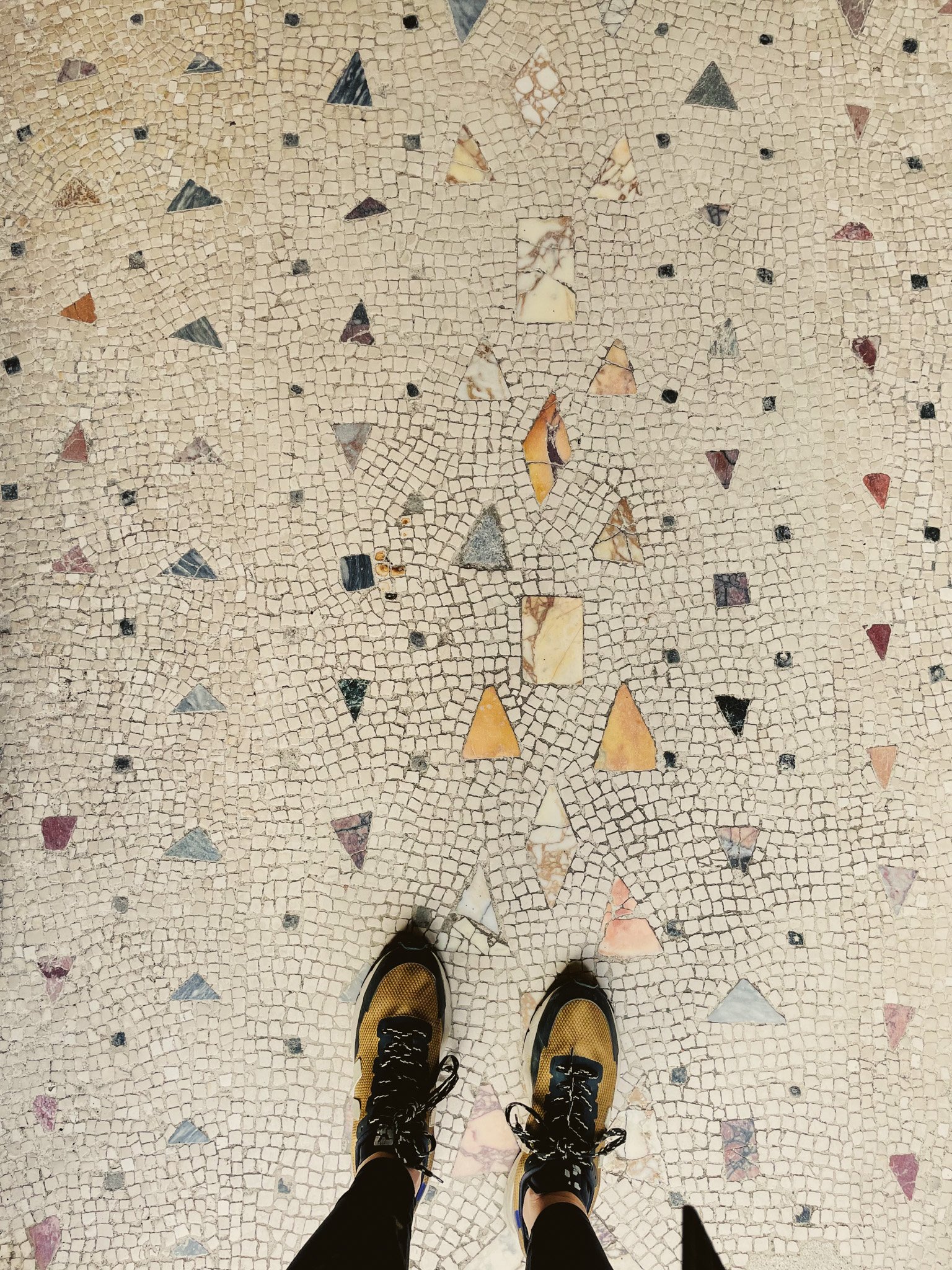
While I’ll never be a maximalist, I am ever drawn to natural materials like stone, and found myself dreaming of more serene version of this beautiful material, perhaps in clé’s new lapidary collection. And returned home to review my favorite moody interior hues, and muralistic wall treatments.
3. Idiosyncrasy, charm, and mystery

Layers of history have left Rome all built up upon itself in sometimes illogical ways. It is idiosyncratic and inconvenient. Its gardens are hidden behind gates and in the sky, and its lives lived in the streets and plazas. It is both ruined and rebuilt.
All of my favorite design projects have the same kind of charisma. Elements that are collected rather than curated. Beauty sometimes yielding practicality, sometimes superceding it, becoming its own kind of reason. Among many things, Rome reminded me to stay attuned to the intuitive. To tolerate a little tension. To leave a little mystery.


A Rome-inspired Vision Board
So here’s what I’m dreaming of now….some imported Italian drama curated in a an elemental, undone style perfect for California.

Finally, I wouldn’t leave you without some recommendations! Check out the links below for what got me excited and what really made my trip:
My favorite playlist
My favorite fiction and non-fiction reads
My favorite film
My favorite restaurant
My favorite park
My favorite bakery
My favorite shop
Thank you so much for reading! Ciao!

Coastal Eclectic in Sausalito
It wasn’t hard to find inspiration for this Sausalito project. Perched on a hill, this historic home featured 180° views of the harbor below. The owner has fantastic taste and a collection of antique items sourced from her travels—she wanted a new furnishings plan (and a fireplace upgrade) that integrated her finds with some modern updates for an eclectic, contemporary look.
Read on to learn how we created a design plan to fulfill the brief!

It wasn’t hard to find inspiration for this Sausalito project. Perched on a hill, this historic home featured 180° views of the harbor below. The owner is a retired chef and world traveller. She has fantastic taste and a collection of antique items sourced often in her travels—she just wanted a new furnishings plan (and a fireplace upgrade) that integrated her finds with some modern updates for an eclectic, contemporary look.
Read on to learn how we created a design plan to fulfill the brief!
Fireplace Upgrade


At some point in the home’s history, a mid-century style painted-brick facade was added to the fireplace. It failed to match the home’s more traditional bones, was asymmetrical, lacked a mantel, and was wood-burning. Not only did the owner want a more eco-friendly insert, but she desired a design that was traditional but special, with a mantel to style. We took her inspiration photo, and added a contemporary twist—instead of more painted brick, we added a surround of Moroccan zellige tile in an unorthodox glaze: charcoal with aubergine undertones. This twist lended a bit of drama, redefined the room’s focal point, and is true to the owner’s globe-trotting nature.
The surround lent the mantel some height, giving the fireplace a deservedly more generous proportion within the room. To highlight it further, we added brass sconces that bounce light off the newly painted walls in a soft halo. The hearth is a rich leathered granite.
2. Inviting Seating


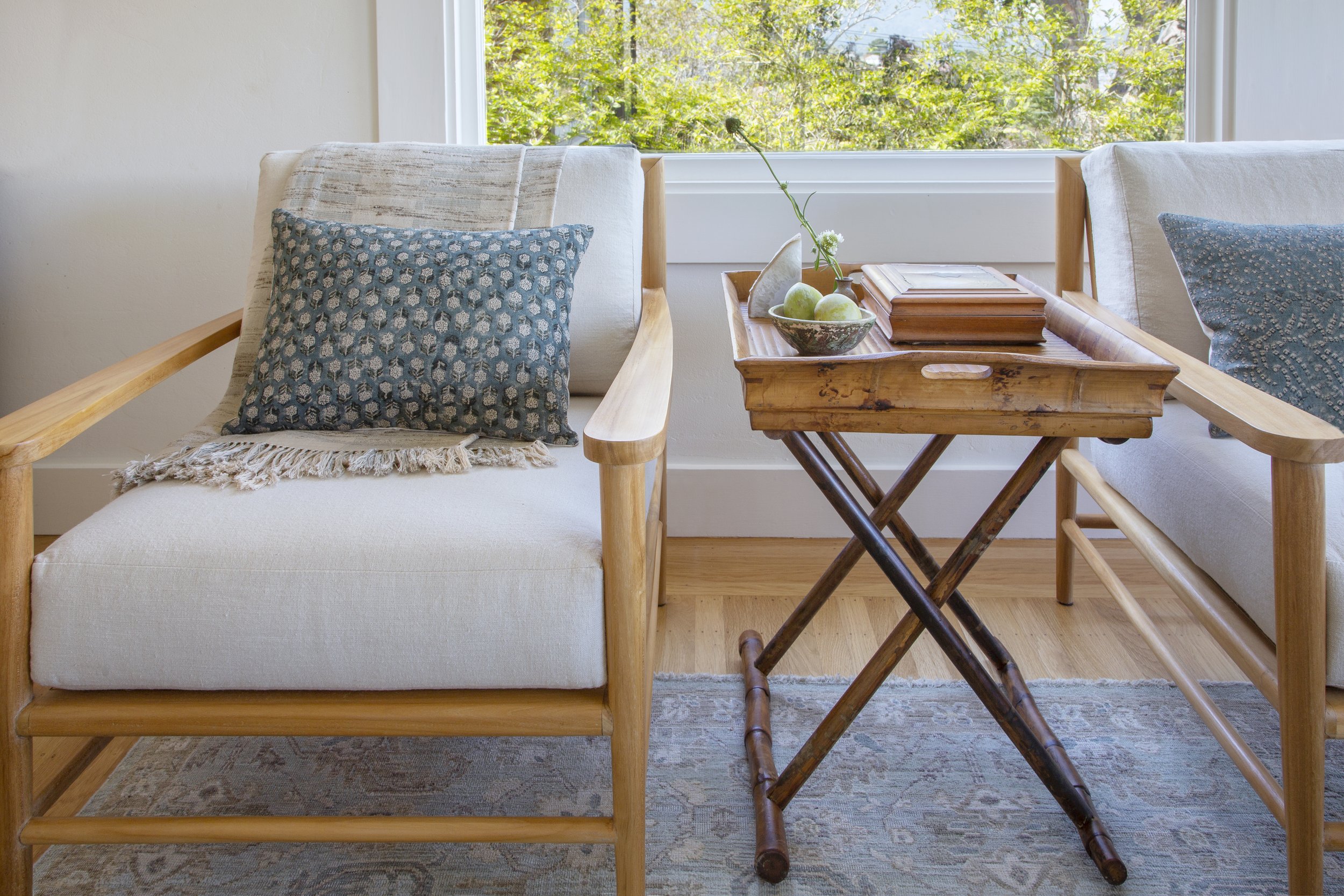

Coming out of the COVID-19 era, our client was looking forward to entertaining again. She asked for a casual but elegant seating plan with room for everyone. We sourced some California casual armchairs and the perfect low-backed sofa to bring in the view.
In addition, we upholstered twin ottomans in remnants from a vintage Turkish rug—just the spot for a beloved grandchild. For overflow seating, we reupholstered the client’s existing vintage pew bench in the dining room with a beautiful Susan Connor fabric in indigo.
3. Perfecting the Mix


The key to making a vintage collection fresh is to mix it up with some modern. Elements should both harmonize and surprise. We feel that a house should feel ‘gathered’ and ‘collected’ rather than professionally designed, and love integrating clients’ beloved pieces into our plans. Often, these old pieces are the inspiration for everything new.

Although this house reads traditional, the eclectic mix keeps it current. Mid-century ceramics, contemporary upholstery, and modern brass orbital sconces play with Paris flea-market finds including ceramic mushrooms from an Hermés shop window and santos statuary (the owner’s). The mix is one-of-a kind, just like this home’s fabulous owner.

If you have questions about this project, or would like to receive a testimonial to our work from one of our clients, please reach out.
Thanks for visiting!
WORK WITH US
Principal Designer | Elizabeth Sims
e: Elizabeth@calafiahomedesign.com
Serving the Bay Area and beyond.